Answer the question
In order to leave comments, you need to log in
What's wrong with website design?
Greetings. The site provides a creative workshop and the design of the site lies in its minimalism. The header and footer are unchanged, only the informational part of the site is loaded. No animation is planned, the only thing I don't know is how to design the tab showing photos of the work.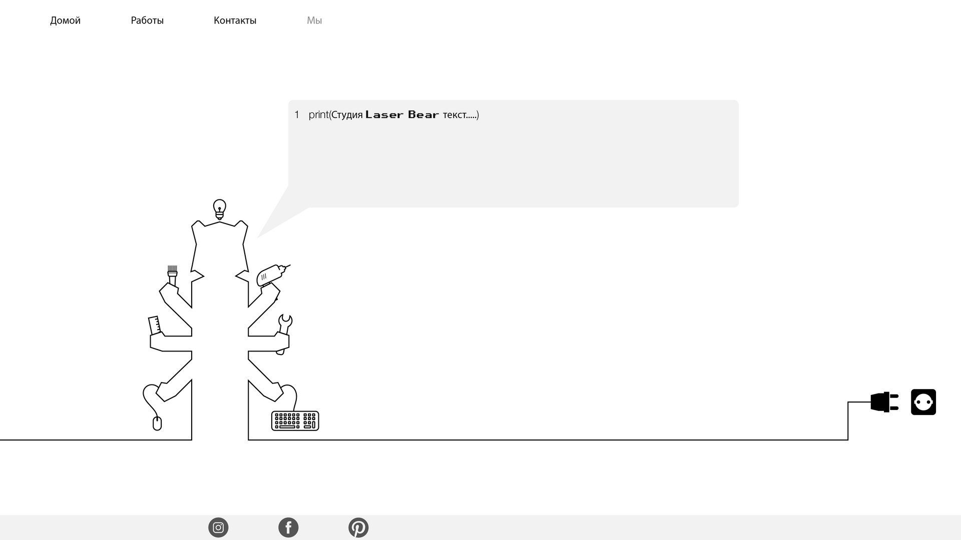
Answer the question
In order to leave comments, you need to log in
The site can be made more interesting, filled with details, correct fonts, typography, illustrations. So far, it's not neat enough to be quality, and not weird enough to pass for brutalism.
More small details, looks empty now. You can make some pencil sketches in the form of animation, but in any case, you need variety.
The problem is that this is not minimalism .
And after that it will be minimalism.
Here are some notable examples of the style:
I think the design is terrible.
I would not say that this is a robot, he needs details, not a contour. It looks more like a toolbox.
The menu is generally like .. are you a typesetter honestly? Do you draw a design for yourself to make it easy?)
Didn't find what you were looking for?
Ask your questionAsk a Question
731 491 924 answers to any question