Answer the question
In order to leave comments, you need to log in
position: fixed; On a different resolution moves out. How to fix it and are there any features of its layout when adaptive?
At the beginning of the scroll, the site menu appears animated thanks to position: fixed; well, JS.
All the Google sources I've looked at explain position: fixed; no content container.
Those. the menu sticks to the upper left corner of the browser and that's it.
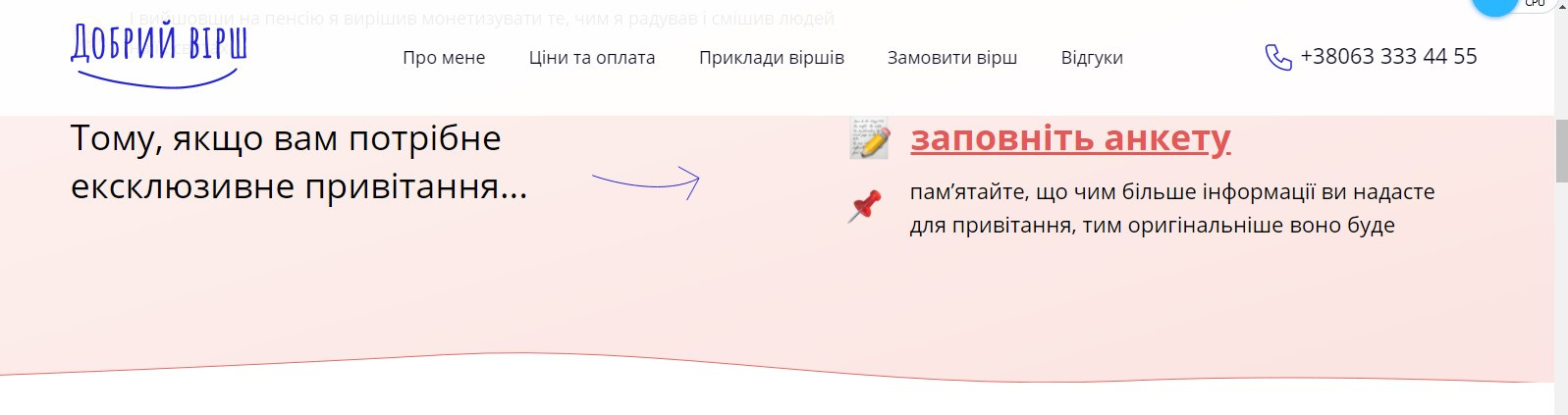
But it is necessary that it be positioned relative to the container (i.e., as it was originally written, without left-right shifts, and it is desirable that the menu background be stretched on the body, and the menu content itself starts at the left border of the container - as in the screenshot) .
On the laptop, I set the nav with extras normally, along the left border of the container (left padding 72px), and I open it on TV - and I need a left padding of 157px.
Screen resolutions: Laptop 1600*900, TV 1768*992.
I uploaded the necessary piece of code on the codepen:
https://codepen.io/Kostiantyn_Kondratiuk/pen/abJJKXV
Somewhere I slow down with positioning or screen resolution...
And a passing question - when will I make an adaptive nav with a menu with position: fixed; will stand iron?
Those. according to key media queries it is not possible to prescribe its size?
Are there any peculiarities when writing an adaptive for such positioning?
If so, please provide an example code.
Thank you.
Answer the question
In order to leave comments, you need to log in
Didn't find what you were looking for?
Ask your questionAsk a Question
731 491 924 answers to any question