Answer the question
In order to leave comments, you need to log in
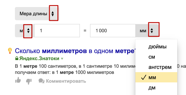
In what cases is the icon with two triangles used (for drop-down lists)?

Can you formulate an explanation, or maybe you know an article where you can read about the difference between one triangle (the standard drop-down list feature) and two? In what cases is a drop-down list marked with an icon with two triangles?
Answer the question
In order to leave comments, you need to log in
In this particular case, Yandex was simply mistaken.
Some Yandex designer loves his Mac very much and considers his UI to be the standard.
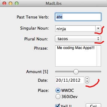
So I drew it like there, On poppies, this is partly dictated by the fact that the value of the non-editable can be switched with the up and down arrows. This can also be explained by the fact that the list there opens a little trickier (positioned on the selected one) and not always down.
In editable lists there is also 1 triangle.
But in the rest of the world, 2 triangles are made on the Num UP/down element, because Depending on which triangle you click on, the value will increase or decrease. On drop-down lists (any) just a triangle (or tick) to avoid confusion.
just in case, I attach a screenshot from the UI on macs (old, but not of much importance)
Personally, I would expect that this is a separate element from the drop-down menu to increase / decrease the value in the input. (But it's not)
Perhaps a hint that the value can be switched with the arrows on the keyboard.
Didn't find what you were looking for?
Ask your questionAsk a Question
731 491 924 answers to any question