Answer the question
In order to leave comments, you need to log in
Design for usability?
Good afternoon.
There is a site that has a very high bounce rate, this is due to the current design and usability in my opinion. And the project wants to live.
The site is dedicated to events in Moscow, paid and free, new content appears on the site daily, there is a personal account with elements of a social network, and much more.
It was discussed in q&a .
What do you think is the best design for this kind of site? If possible, give options with examples, various tips.
What do you think about this template: livedemo00.template-help.com/magento_34401/
Answer the question
In order to leave comments, you need to log in
Decide what your site is for, decide what people should see when they come in first and start numbering important things in lists, for example:
Notes:
1. Use of bright colors for many blocks. The user's attention is "dispersed", it is difficult for him to choose.
2. Control elements are small and not highlighted; links are not marked.
3. Small gaps between blocks of content. As a result, all blocks of content merge into one common “expressionist painting”.
4. It is better to remove zombies.
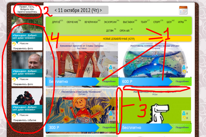
Do you have a news site? So focus the user's attention on the news and its presentation. Now the site rather says, “look how many colors and patterns I have.”
Compare for example with www.bbc.co.uk/russian/
You need a new concept.
I have been in interface design for more than a year, and based on the tasks of your project, I would make it in the form of a calendar. That is, when a person gets to your site, he immediately sees a schedule for a week or a day or a month (it all depends on the frequency of events) and thus there is motivation to attend one of the events. Everything else is details, but I would start doing the main frame that way.
I don't know how relevant, but you ignored good advice.
3. Small gaps between blocks of content. As a result, all blocks of content merge into one common “expressionist painting”.
Didn't find what you were looking for?
Ask your questionAsk a Question
731 491 924 answers to any question