Answer the question
In order to leave comments, you need to log in
How do you organize components and styles in Figma?
My experience with Figma is about a year. Not so little, but so far I can't come up with an optimal organization of the layouts.
As you know, Figma's ideology is based on components and styles. And everything in them seems to be good and logical... But only on condition that the design develops strictly progressively and smoothly. In real life, this almost never happens - you constantly have to try alternative solutions and experiment.
Example 1
I have 10 colors written in named styles. It would seem that everything is convenient: you change one variable - it changes everywhere.
But the customer suddenly wanted to play with flowers. I need to make a copy of the layout, place it next to the old one. In the new one, adjust the colors, and in the old one, leave it as it was. In fact, duplicate all styles - but that's okay.
More difficult is how do I find all the elements that had brand-color-old fill and replace it with brand-color-new? Paradox: styles are invented in order not to climb through hundreds of elements and not to change colors manually - but you still have to climb and change, only not colors, but styles.
Example 2
There are buttons, each flavor (primary/secondary/etc) and state (hover/etc) in its own component. A customer comes - but let's try rounded buttons instead of square ones!
I have to clone all the buttons, detach them from the original, create separate components - this is understandable. But then I have to crawl around the layout and replace instances in a hundred places.
Yes, I could modify the original components, but I want to keep the previous version! But not just a "backup just in case" (then you could just save some-mockup.fig.bak file to disk), but so that you can continue to work with both versions in parallel and decide which one is better in the process.
Example 3
Where is the best place to store components in a multipage document?
Select a separate page? It is logical, but in practice it is hard to constantly jump from page to page.
Smeared across the pages? Comfortable at first, but then the pain of chaos.
Example 4
I think everyone knows that components can be put into folders using a slash.
Type: button / primary / hover. In addition to ordering, this makes it convenient to change an instance to a "related" one - for example, quickly change a simple button to a pressed one, and not look for it among hundreds of other components.
There are two problems here.
First, these chains grow a lot, something like this: desktop / dark theme / button / primary / hover.
Secondly, the name of the page is added to the beginning of the chain - and see point 3.
In general, share your experience.
Answer the question
In order to leave comments, you need to log in
Well, the dudes came up with a fucking cool new design paradigm, but basically threw the puppies into the river, and now we have to swim out ourselves. He himself redid the same layout a billion times, because. in the process, new ideas constantly came up on how to optimize this very process.
About flowers. There are two approaches, old and new.
Old - store the color in the component, for example in a 24x24 square (not the point). The point is to use this component as a mask to color an object (anything - text, icons). There are cases when it is a thousand times cooler and more convenient than styles. Example: A navigation bar where buttons have an icon and text next to them. In the component of this very button, we set the color of the icon with the notorious mask. We replace icons, we change texts, we receive the menu. Now if you need to change the color of all icons - change the color component that masks them. The advantage is that you do not need to create a separate style for these buttons, that is, we minimize the styles. But we get extra components, yes.
The new one is to keep the color in the style, there is no need to explain it once again, but there are nuances. The main pain is the naming policy. How to name colors? "Primary accent - light/medium/dark", "Secondary accent -..."? Or "Blue - light / medium / dark", "Green - ..."? Or "Active / Disabled / Hover"? Personally, I decided for myself that the first option is better. Another problem is that I want to have at hand not only a limited set of color styles, but a whole palette, this is especially true at the beginning of the design, when what colors will be fixed in the layout.
But it's a whole bunch of styles. For example, there are 256 of them in the material palette (geeks, lol), and flipping through a small panel with styles simply takes precious time. In this case, component colors come to the rescue, because. components are neatly sorted in the instances drop-down menu (if you name them correctly, of course).
About your problem - have you tried the selection tools?
*
Regarding the condition of the items. Previously, I also stored other states of the button inside the button, in a hidden form.
Now I do it easier - I create separate components of its background: active, hover, etc., and create a button component, for example, from text and an active background component, which I then replace with disabled, focus, hover, whatever, well, I change the text color (color style or component color again). This greatly simplifies the structure of the button and improves the appearance of the layer stack.
As for your problem - you create separate components, and then go around the layout and replace the instances with new designs, and you try to do exactly the opposite: create copies of the original components, detail them as a back-up, and boldly modify the originals. In theory, this will save time, as the design will change automatically, and if something happens, then you will redo the components in the old way. This process is greatly accelerated by shortcuts ctrl+alt+c and ctrl+alt+v (copying and pasting object properties) while holding ctrl (this allows you to get inside the group in one click).
Regarding the storage of components. In general, I initially taught myself to put components on a separate frame, and not leave them where they were created. Hemorrhoids of course, but in the end this approach is much more productive.
And the problem with jumping to a frame (or a selected page) with components and back to the layout is solved very simply: I stupidly drag all the components closer to the layout I'm currently working with, even if it's on a different page. Saves a lot of time.
Concerning policy of names of components. Here the principle that allows you to competently organize folders on your hard drive works well: the directory structure should be as flat as possible. Even for a large project, it is enough to create only three frames:
- Icons (even if under a hundred)
- Interface elements (atoms and molecules)
- Interfaces (organisms and pages)
Well, if you decide to create component colors, there is also a frame for them. Inside these frames, you do not need to use slashes in the names of the components!Components will inherit the names of the page and the frame they are on, such as Page1/icons/vk-logo. It is clear that, for example, there can be hundreds of icons, but in the end, such a flat structure greatly contributes to the speed of work, and a quick search in a long list through the menu of instances should be facilitated by competent prefixes and suffixes of names, for example, instead of creating a separate catalog of social network icons like Page1/ icons/social/vk, you need to stupidly make the name of this directory a prefix: Page1/icons/social-vk
Well, in the same way for atoms and molecules, in the same list you will have a button, a hover-bg, and a hint + button + error, and everything else, don't be afraid of it - you get used to good things quickly, and you will forget long branching nested menus like a bad dream.
An important point in cataloging components: don't wrap slashes with spaces! That is, you need to name it like this: catalogue1/subcatalogueA/component-alpha, not catalogue1 / subcatalogueA / component-alpha. The bottom line is that when exporting components to files on the hard drive, broken folders are formed if you use spaces around the slashes.
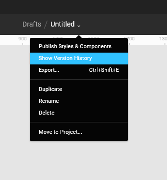
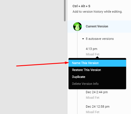
Example 1 - 2: in order not to create several different documents, and then not switch to them from those that the client accepted and those that were not accepted, there is a "version history".
For example: today a customer wrote to me that the colors on all my buttons are terrible.
Now I need to change all the colors and I go to
Didn't find what you were looking for?
Ask your questionAsk a Question
731 491 924 answers to any question