Answer the question
In order to leave comments, you need to log in
Why do all design patterns leave an indent between the border of the list and the first item in the list?
Here is the simplest example: 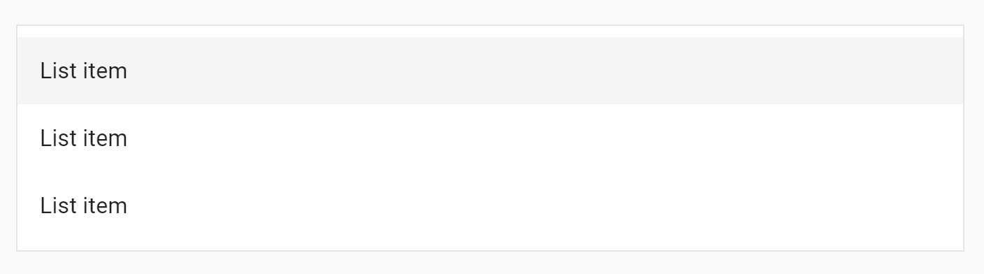
The same indentation between the edge of the list and the first element is almost everywhere: Windows context menu, poppy context menu, start menu, notification center ...
Why do they do this?
Answer the question
In order to leave comments, you need to log in
It's simple: if this indentation is not done, the space between the elements will look disproportionately large compared to the edges - because there are two paddings side by side, the space visually doubles.
Another solution is to separate the list items with lines. But now it is unfashionable (unfortunately), give everyone clean and empty air.
There is no hidden meaning. They really add an indent to the material - I don’t know what it is connected with. But in the same material there are enough examples when the indent is not added. Examples are easy to find by downloading Google apps.
The need varies. Example:
If the list were pushed to the edge, the shadow would eat up space. Another question is why the shadow is here , but let's leave the question to the designers.
On one well-known site, they didn’t add an indent:
At the end of the video , I touch on the topic of indents in the VK application for iOS - they are scattered both with and without an indent.
There is no correct option , see if necessary.
Because - look at the design of books - these are the progenitors of interface design styles (;
Didn't find what you were looking for?
Ask your questionAsk a Question
731 491 924 answers to any question