Answer the question
In order to leave comments, you need to log in
What parameters to set for modular grid in Figma?
Good afternoon! The crux of the matter is in the title.
The problem is misunderstanding the parameters.
There are specific options for the 12 column grid.
Option 1.
The container should be 1170 pixels, but it already INCLUDES 15 pixels of padding (so that the content does not stick to the screen), and as a result, the width of the content part is 1140 pixels.
Option 2.
The container of the content part is 1170 pixels, plus paddings of 15 pixels, and as a result, the container is 1200 pixels.
A question for layout designers? Which option is correct?
Farther,
with option 2, everything in figma is clear, when setting the parameters for the grid 1170, I set: columns 12, column width 70, intercolumn width. 30, the total container is 1170, and I add the second grid: 2 columns, spacing width 1170, column size 15 (for paddings). And I get a container of 1200 pixels.
But with option 1, it is impossible to make a container 1140, due to mathematics, because when setting the parameters to 12 columns, the width of the intercolumns is 30, the width of the column is 65, a container of 1110 pixels is obtained.
To get a container of 1140, you need to make the column width 67.5, but you can’t set it like that.
I make a second grid with 2 columns of 15 pixels each, and the distance between them is 1110 pixels, and I get 1140. But then what about the standard 1170 ???
Am I misunderstanding something? What?
Answer the question
In order to leave comments, you need to log in
The correct option is number 2.
The bottom line is that when layout in bootstrap, by default, “box-sizing: border-box” is written in the css properties. This property is “Used to change the algorithm for calculating the width and height of an element. According to the CSS specification, the width of a block is the sum of the content width (width), padding (margin), margins (padding) and borders (border). The same is true for block height. The box-sizing property allows you to change this algorithm so that the width and height properties do not set the content dimensions, but the box dimensions.
For example, we have a block with width: 600px, padding: 20px and another (stroke) border: 2px as a result, the width of this block will be recalculated and become 644px, and with the box-sizing: border-box property it will remain 600px, but at the same time the inner content will adjust with increasing padding'a for example.
What exactly is the solution? Keep in mind that the total container will be 1200px (1170px - content + 15px padding on the right and left.
In fact, the first option can be set, but stretch must be specified. In this case, I specifically created a frame width of 1170: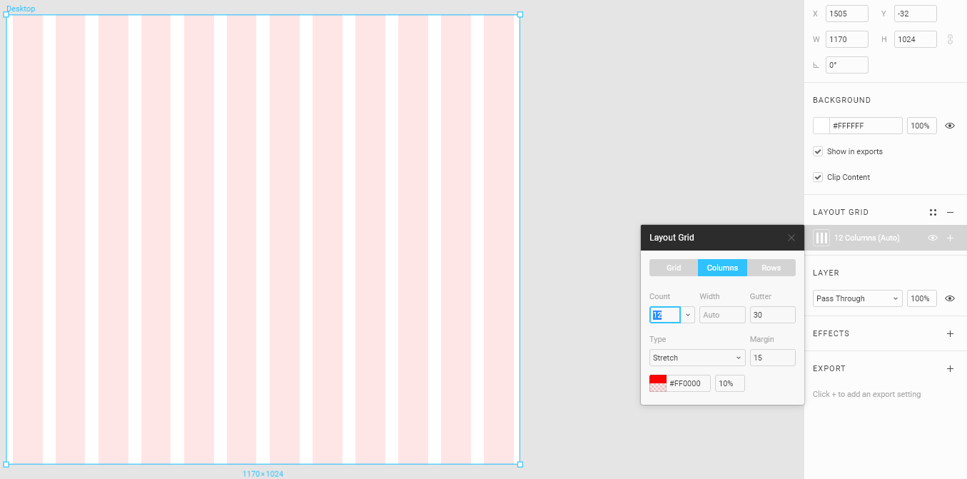
65px column, 15px padding is all.
Ultimately the total width should be 1140. And 1110 is the area with no side padding where you shove all your design.
1170 - it was the 3rd bootstrap that everyone fought with. Their columns were 67/68 px. Now strictly 65 + 15.
The answer chosen by the solution is a gross mistake.
Didn't find what you were looking for?
Ask your questionAsk a Question
731 491 924 answers to any question