Answer the question
In order to leave comments, you need to log in
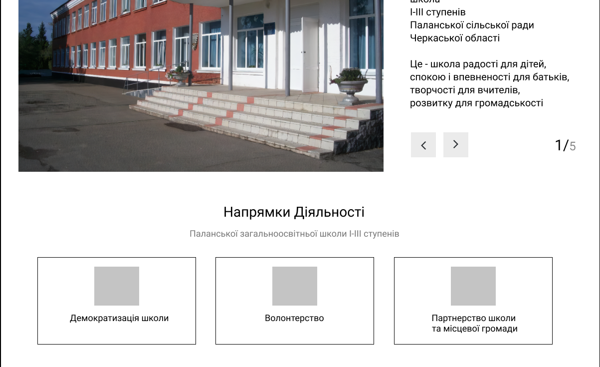
What is the best way to position the blocks in the design scheme, in the case described in the body of the question?
I make sketches for website design. Here's the part I don't really like, I think it's because of the positioning.
 .
.
Is everything normal, or is it still pressing on the eyes that after the block, where the picture is on the left and the text on the right, there is a block where the text and cards are in the center? If you agree with the second part of the last statement - write which, in your opinion, is the best option to solve the problem. In any case, answer the question if you have formulated the correct answer in your opinion. Thanks to all!
Answer the question
In order to leave comments, you need to log in
Didn't find what you were looking for?
Ask your questionAsk a Question
731 491 924 answers to any question