Answer the question
In order to leave comments, you need to log in
In what cases can a 4px grid be neglected?
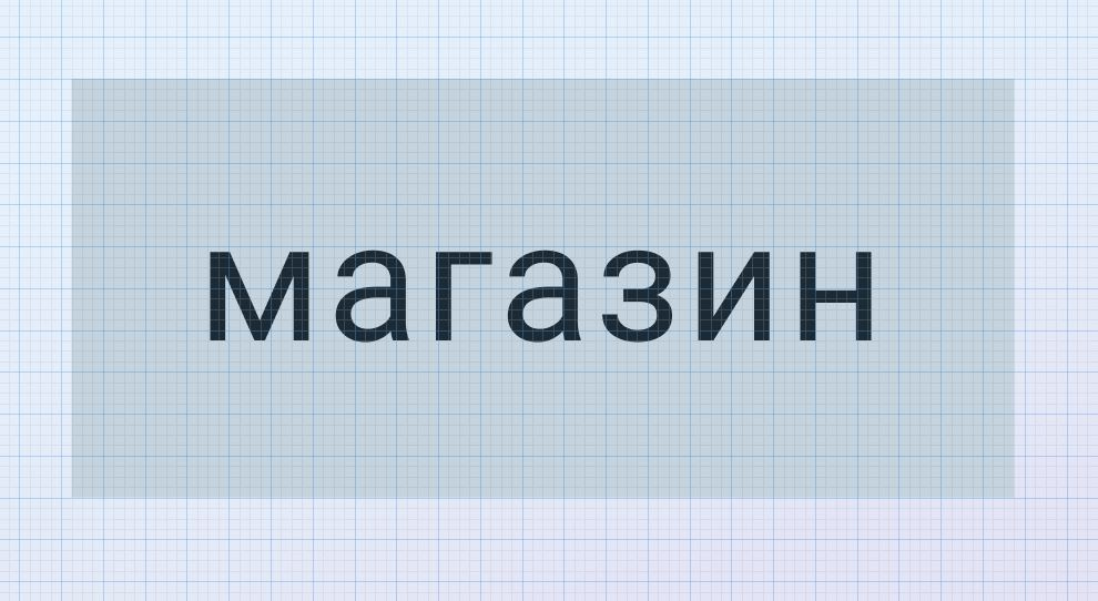
What is the correct way to use a 4px grid? For example, a button, if you align the entire button to the grid, the text is not on the grid, and vice versa, if you align the text to the grid, the button itself exits. What is the right and logical thing to do?

Answer the question
In order to leave comments, you need to log in
Everything is on the grid - paddings of 16px (4 * 4), and the width of the content is determined dynamically, depending on the content.
Vertically, in such cases, the alignment for the text is neglected so that the button is consistent with other components in height. This is more important.
If the question is about the horizontal width, then it is usually dynamic and should not fit into the grid.
From what I can see, the line-height of the text is 8px and the vertical padding is 16px. So everything is fine, as Roman noted, no one will notice the difference if this font is used in the same contexts. But there are situations when you need to combine two different fonts and their deviations can be quite serious. In such cases, I do it simply, separately add text to the frame and use autolayout to move the pixels to the desired alignment.
Didn't find what you were looking for?
Ask your questionAsk a Question
731 491 924 answers to any question