Answer the question
In order to leave comments, you need to log in
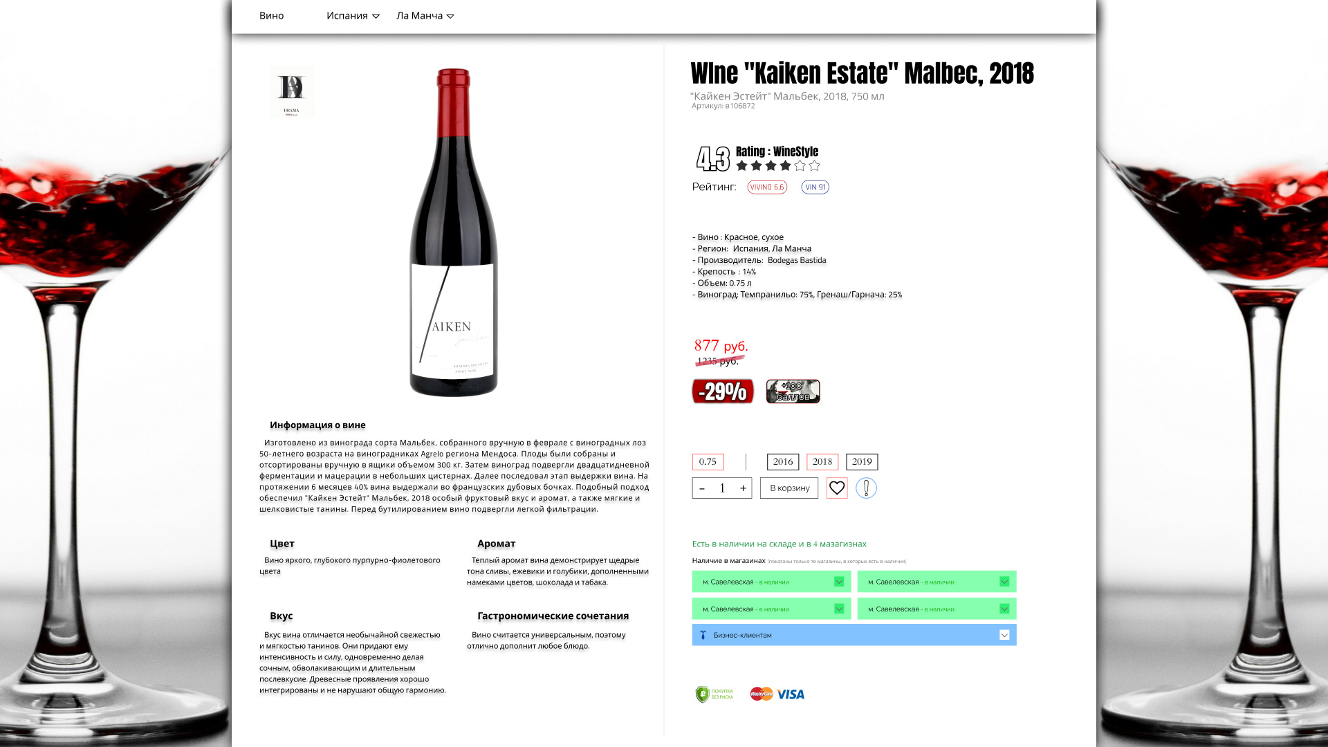
Vol. 2 What to change in design?
I already asked this question and they gave me a lot of useful advice and advised a book that I had already begun to study.
What to change in the design of the site? - previous post
Do you see progress? Did I correctly take into account the comments that were written to me in the comments in the last post? What other points can you highlight to improve the visualization of the site?
Answer the question
In order to leave comments, you need to log in
Remarks
- You can clearly see how small the text is compared to the rest of the elements
- You can't see any alignment of text blocks on the grid
- The padding jumps, looks very unprofessional
- There is little air (padding from the edges, between elements
- Awfully fat shadows, directly make the whole design dirty
- The bold font of the titles and the rating is out of topic, it's hard to read in comparison with the rest of the text
And the most tinny:
- The shadow of the text! It's generally just an excuse to close it all right away.
PS The previous design was better than this one. It would be better if it was finalized.
Didn't find what you were looking for?
Ask your questionAsk a Question
731 491 924 answers to any question