Answer the question
In order to leave comments, you need to log in
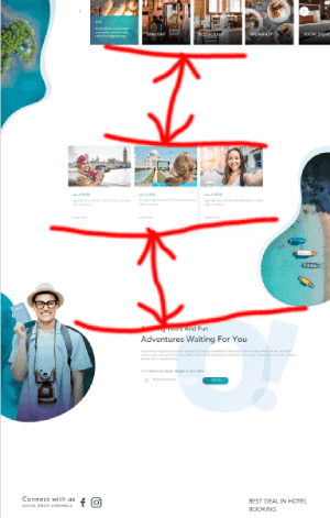
How to think over the adaptability of the indents between the main sections of the landing page at the beginning of the layout?
Let's say the layout is 1920x1080.
You need to make it adaptive for several smaller resolutions (screen proportions can be reversed - 320x640 for example). 
How to proportionally consider the size of the indents between sections?
From the simplest options, I see:
1) set in pixels, change to media query
2) in vh or vw, but then due to other proportions, you still have to select a media query
Is there any general trick to increase the speed of layout, Or does each resolution need to be selected manually so that it looks pleasant purely subjective, not tied to the original, albeit not a complete layout?
Answer the question
In order to leave comments, you need to log in
Didn't find what you were looking for?
Ask your questionAsk a Question
731 491 924 answers to any question