Answer the question
In order to leave comments, you need to log in
Answer the question
In order to leave comments, you need to log in
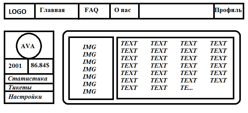
I would hide the top menu and the left menu under a single sandwich (with the exception of AVA, 2001 and $86).
There are few menu items, so even if the left block (AVA is no longer shown in it, but we leave 2001 and $86, let it be duplicated from 2 places) does not fit into the screen, scrolling will be quite obvious.
Main ("sandwich" top right) and additional: account (swipe left). Look at the implementation of Material Design - it will immediately become clear.
See how I did it with the main one: xmoonlight.github.io
I usually do this: on top I make a menu, then a logo, and then again a menu, only I call the opener "Categories". Or whatever in your case.
Didn't find what you were looking for?
Ask your questionAsk a Question
731 491 924 answers to any question