Answer the question
In order to leave comments, you need to log in
How to organize the UI on the site
Good afternoon. There is a task - to make an interface for the catalog of categories (reminiscent of an online store).
The catalog is as follows:
-1 level - categories
-2 level - subcategories
-3 level - catalog objects themselves Navigation will
be
on the first level in depth, i.e., 1 page - 1 level -> 2 page - 2 level...
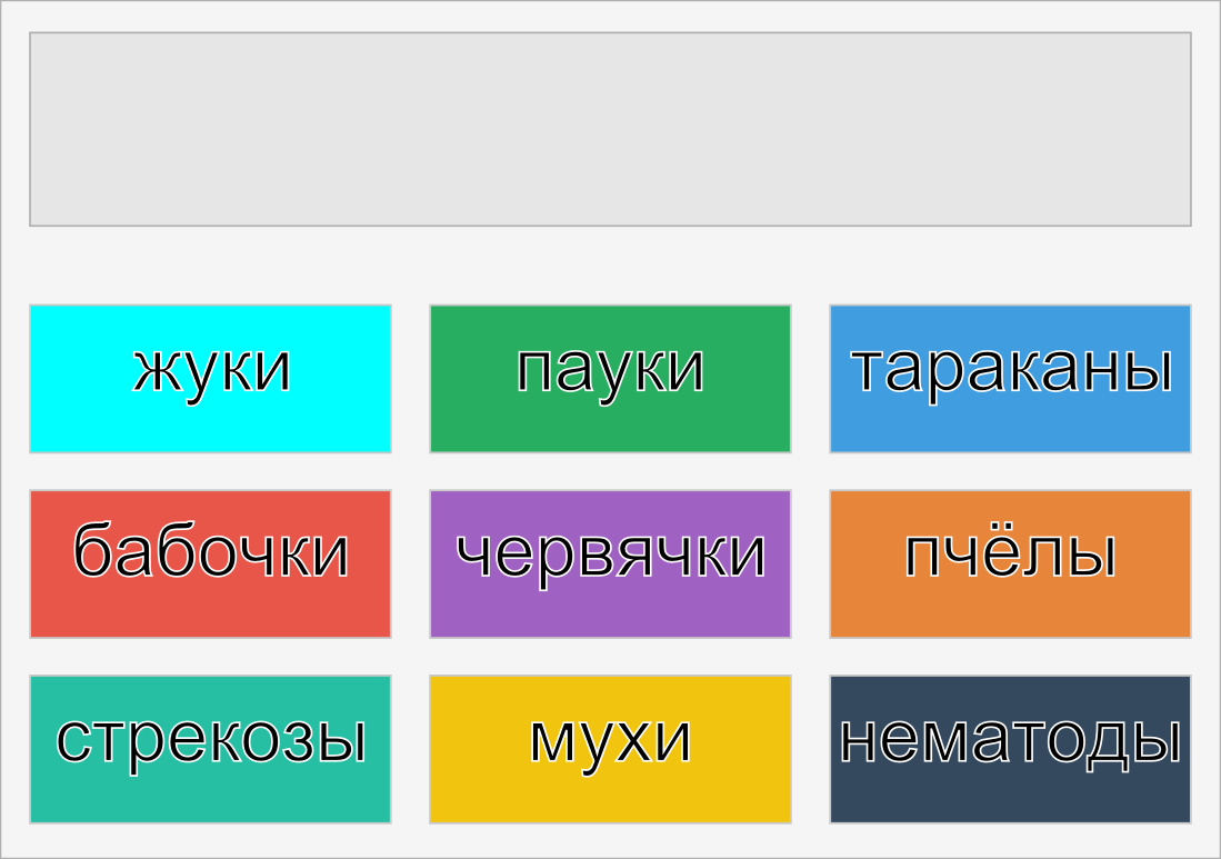
in Flat style, so that these categories are displayed on the page as tiles of different colors. When hovering over a tile, some info about the category is displayed (for example, the number of elements in it). When clicked, it goes to the category page, where subcategories are displayed in the same way.
Questions:
Is this normal?
If not, how would you recommend doing it?
UPD: picture
Answer the question
In order to leave comments, you need to log in
Hover effect (to view category description): flip-click
Separate pages for each level is nice, but not as pretty. Using JavaScript (such as jQuery effects) you can achieve animated "transitions" from one level to another, for example with this effect .
Didn't find what you were looking for?
Ask your questionAsk a Question
731 491 924 answers to any question