Answer the question
In order to leave comments, you need to log in
How to "narrow" the navbar?
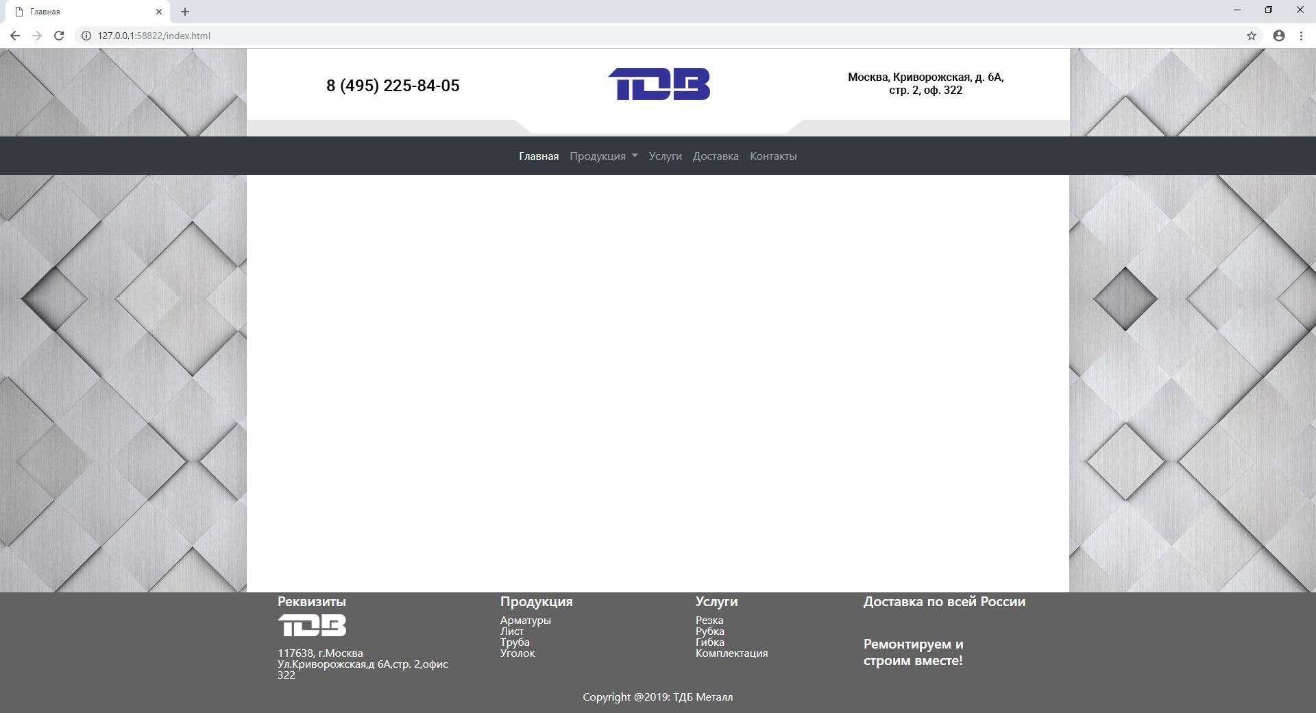
Friends, good afternoon. I ran into the problem of a design that was not adjusted to the 12-column bootstrap layout, and the site itself was not the full width of the window. In general, below is a screenshot of how everything looks, the essence of the issue is this. It is necessary to narrow the navbar and footer to the size of the "white" page, while maintaining adaptability. Any ideas? Or only media queries resting on different screen resolutions? If only media, then I will fit it to the main sizes of the devices, but if the user suddenly wants to use the browser in a non-standard resolution, everything will go down the drain. I really want to hear from you <3

Answer the question
In order to leave comments, you need to log in
Didn't find what you were looking for?
Ask your questionAsk a Question
731 491 924 answers to any question