Answer the question
In order to leave comments, you need to log in
How to make after and before responsive?
Hello. There is such a design:
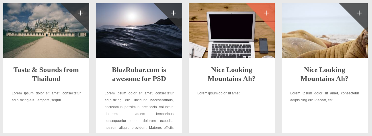
.news-block:after {
    content: '+';
    font-size: 35px;
    color: #fff;
    position: absolute;
    margin-top: -435px;
    margin-left: 260px;
}

.news-block:before {
    content: '';
    position: absolute;
    border: 50px solid transparent;
    border-top: 50px solid #373737;
    border-right: 50px solid #373737;
    margin-left: 200px;
    opacity: 0.8;
}

.news-block:hover:before {
    content: '';
    position: absolute;
    border: 50px solid transparent;
    border-top: 50px solid #f26c4f;
    border-right: 50px solid #f26c4f;
    margin-left: 200px;
    opacity: 0.8;
}Answer the question
In order to leave comments, you need to log in
why margin-left ? absolutely arrange and everything will be in the herringbone: right: 0; etc
Didn't find what you were looking for?
Ask your questionAsk a Question
731 491 924 answers to any question