Answer the question
In order to leave comments, you need to log in
How to fix the site so that it does not scroll left and right on the phone, exposing the white background?
Made a simple landing site. It is responsive and works well on all screens.
The problem is that on a phone or tablet you can scroll it horizontally with your finger, although all the information fits perfectly without scrolling, and just a white background opens there. It turns out that the site "dangles left and right" with the usual vertical scrolling with your finger, when you scroll carelessly, not strictly vertically.
How to solve this problem?
Do I understand correctly that it will be enough to disable horizontal scrolling on the touch screen? How to do it?
Answer the question
In order to leave comments, you need to log in
Apparently some element has a negative horizontal value.
Two solutions:
body, html{
  max-width: 100%;
}body, html {
overflow-x: hidden;
}In general overflow-x: hidden is always a safe bet, BUT if you don't have problems using Bootstrap grid or flex-box (which you as a developer should be 100% aware of) then it's best to avoid overflow-x: hidden;
I highly recommend looking at how flex-boxes work here . There, the guys made a container with elements over which you can observe how many possibilities Flex has. This container looks like this: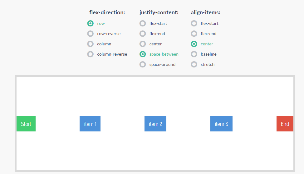
Didn't find what you were looking for?
Ask your questionAsk a Question
731 491 924 answers to any question