Answer the question
In order to leave comments, you need to log in
How to choose the right concept and color combination for a logo?
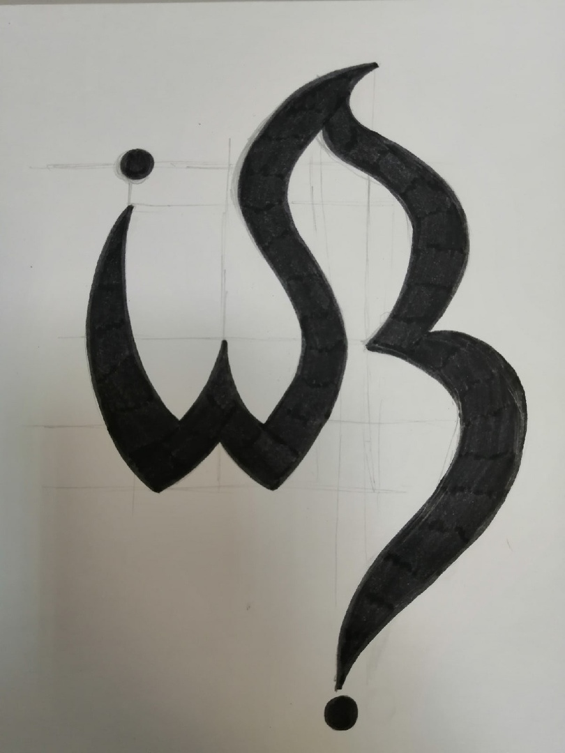
Hello! I faced such a problem: I came up with a logo for the radio station "Musical Wave" for music of various genres (rock, classical, jazz, etc.), but I was advised to focus on some 1 priority direction. In the course of deliberation, the genre of rock music disappeared by itself due to the ornate logo, so I decided to stick with the classics. But another problem arose: how to come up with a color combination so that it would not be frequently used and uniqueness could be traced. The proposed range of sepia does not suit me, I want something more strict and at the same time concisely light. I was thinking about the classic b/w, but everything has already been invented before us (the same Mezzo) ... Or is it still to think on a larger scale? For example, not a radio station, but an Internet portal for radio (like NasheTV)?
Answer the question
In order to leave comments, you need to log in
Didn't find what you were looking for?
Ask your questionAsk a Question
731 491 924 answers to any question