Answer the question
In order to leave comments, you need to log in
How to align text with this line height?
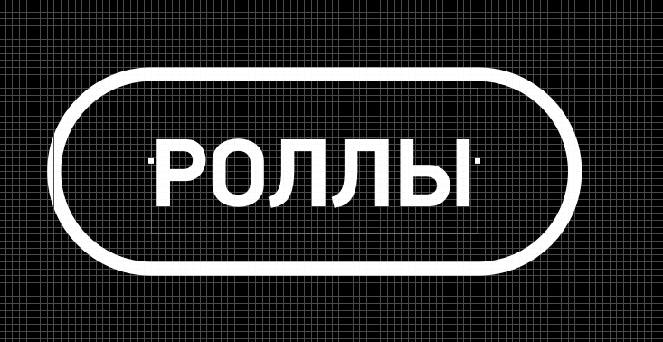
I'm working in a sketch, I need to align the text inside the button
By increasing/decreasing the line-height, the space only increases/decreases from above, that is, the letters are not in the middle 
Because of this, it turns out to align the text only optically, without maintaining the same indents
Tell me, this is such a bug of the font itself ? or sketch? In general, how legal is it to do this?))
I want to keep some certain proportions, and not adjust by eye
Answer the question
In order to leave comments, you need to log in
On the Web, only optically, in polygraphy, you can convert text into curves and align it without a "font frame".
This is not a glitch. The "font frame" has a mathematical center and it does not coincide with the real center of the font. capital letters have diacritics.
Because of this, it turns out to align the text only optically.
There is no universal way for all fonts. All have different indents both vertically and horizontally. Although the width is usually not a problem, the height for each font will have to be tried. Another matryoshka is needed, intermediate. You need to put this text in another block, and it is already leveled-centered. This intermediate matryoshka needs to be adjusted so that it fits the desired font and a specific height is fixed for it. Try to put different inscriptions and choose the most even option. I would do that.
Everything is very simple: set the height of the line equal to the height of the object in which you place the text.
And that's why the sketch adds space on top of you - I don't know, maybe a bug, try this approach on different fonts.
Didn't find what you were looking for?
Ask your questionAsk a Question
731 491 924 answers to any question