Answer the question
In order to leave comments, you need to log in
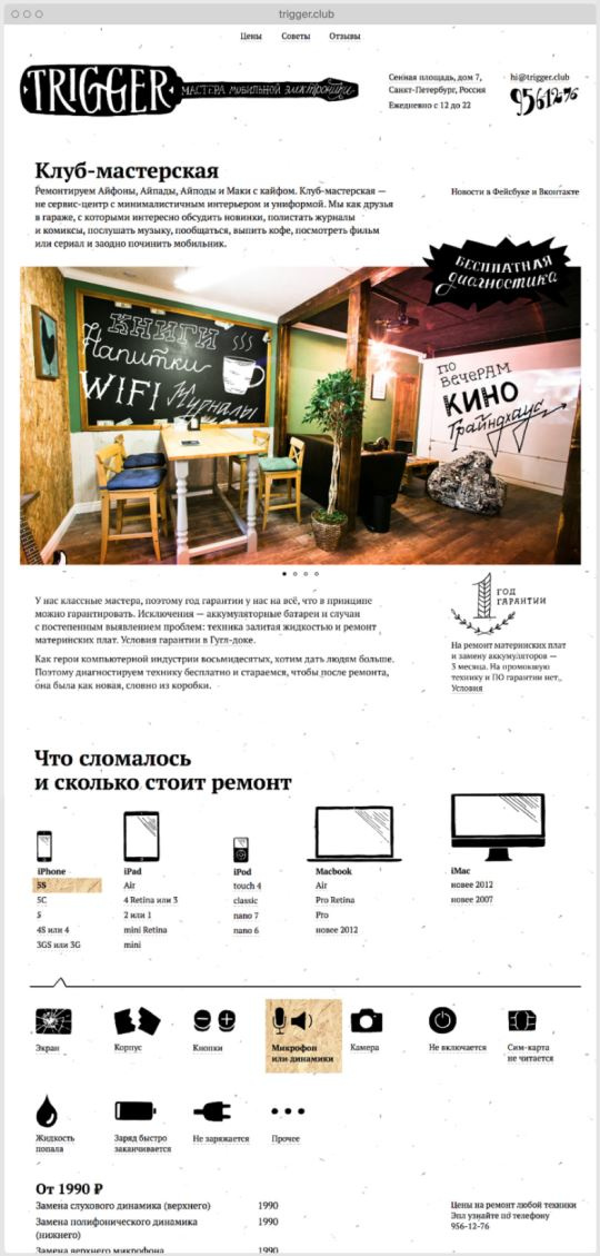
Criticize the design of the site. What about structure?
Criticize the design, please. Speak directly, as it is - what you do not like, why, and how it will be better. And rate it on a 10-point scale, where 7 is good.
The core of TA is women and the elderly. First of all, I ask you to express your opinion about the structure. As for proportions, colors, icons and illustrations, it's all pretty temporary, just to convey the mood; then I'll do it a little better.
Here is an interactive prototype: https://marvelapp.com/prototype/c8hd1g6
you can scroll through, poke all sorts of buttons, although not all of them are active. To understand which are active, click on an empty space, and they will be highlighted.
Answer the question
In order to leave comments, you need to log in
I was not too lazy to find a job as a designer in 2013-14:

Here, in principle, for people, and not for your weak cores. And most importantly: there is nothing particularly superfluous, BECAUSE IT IS NOT NECESSARY. What you need is that you poked randomly into the layout, but people don’t need it.
But it will come, layouts in 6-10 and with the understanding that the design of layouts is a logical conclusion to everything else. And after the delivery and launch of such layouts, the owner will have to redo all this, since there will be no necessary conversions of applications + there will be no good organics (again, as you rightly noted, including due to the fact that your "design" will be covered with a bunch of slow plugins )
Hard zero. Zero.
What to do: read my answers on the toaster, there is a concentrate of useful information, even with examples, links and layouts with explanations

Here, at first glance, the arrow on the side prevents the authorization window from closing (in fact, it doesn’t), which is not very pleasant.
Didn't find what you were looking for?
Ask your questionAsk a Question
731 491 924 answers to any question