Answer the question
In order to leave comments, you need to log in
All my logos are incomplete. What's the matter?
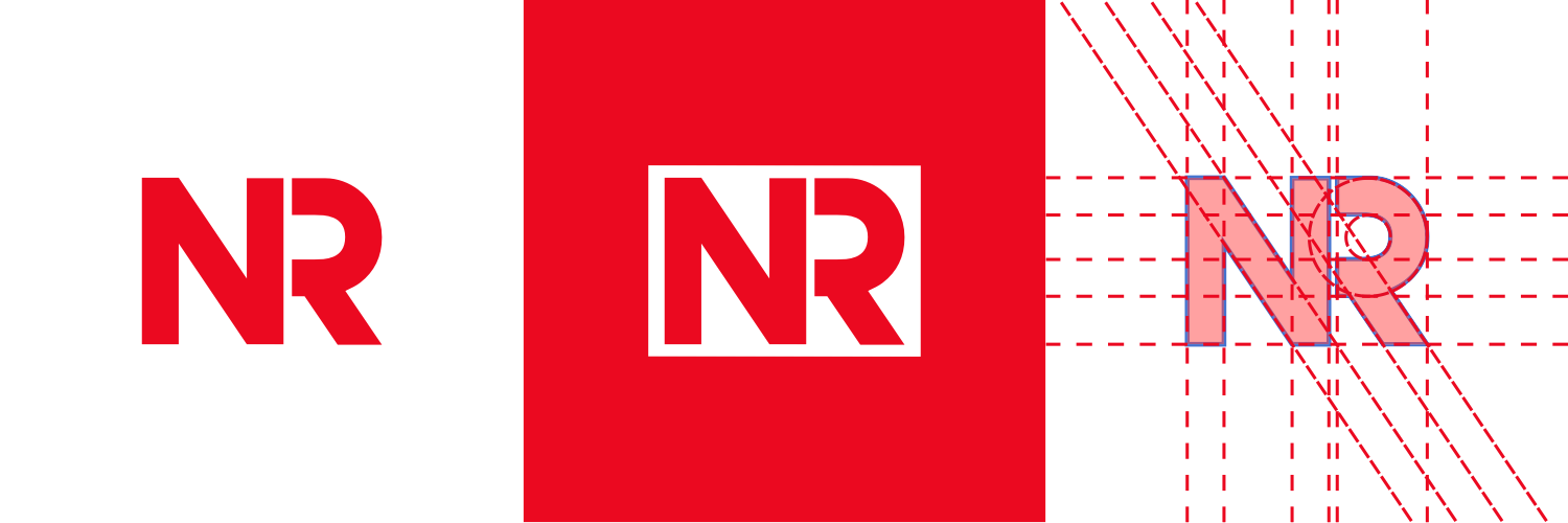
When I look at my work, I get the impression that they are not finished. I don't know what's the matter. I try to make them as even as possible. Here is an example of my latest logo: 
What exactly is wrong with it?
PS I work in CorelDraw X3 (13).
Answer the question
In order to leave comments, you need to log in
In this case, you don't have symmetry. You can push R or make it a little wider. Or do not separate the letters at all, then there will be no need for symmetry.
If you don't know what's wrong, then read books and learn to understand what exactly is wrong.
Plus, building logos according to some strict, mathematically verified grids is bullshit. The logo, first of all, should look good optically. And when they are wise with letters / text, just such garbage turns out. Study typography to understand how letters have been built over the centuries and why they are that size. Until you start to understand this, there will always be “something wrong”.
you have a syndrome of overestimated requirements for work. you need to get rid of this. have what the client wants. made? wave your hand! you can add on for years.
I think it is not necessary to explain what kind of brand and how much it hurts. I'll draw this in a couple of minutes. but it will also be difficult to get up.
In my opinion, there is not enough air in this sign. R want to push back and make a little wider. It is not equal to N.
The white rectangle can also be safely enlarged.
In my opinion, a normal logo, you need to see more logos of 5-8 pieces so that there are options that can be criticized. In general, design is subjective and taste))
Didn't find what you were looking for?
Ask your questionAsk a Question
731 491 924 answers to any question