Answer the question
In order to leave comments, you need to log in
Why is the scale of the blocks in the iPhone browser different?
So, there is a layout. The page width is specified for mobile devices.
But, the browser increases some headings. Naturally, the rest of the layout goes. How to ensure that both headings and text are the correct size?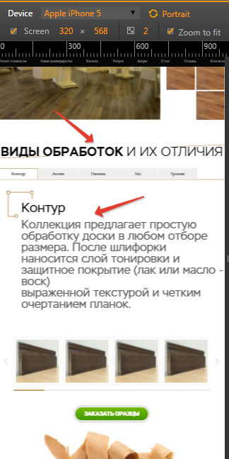
Answer the question
In order to leave comments, you need to log in
Didn't find what you were looking for?
Ask your questionAsk a Question
731 491 924 answers to any question