Answer the question
In order to leave comments, you need to log in
Should buttons be uniform in an iPhone app?
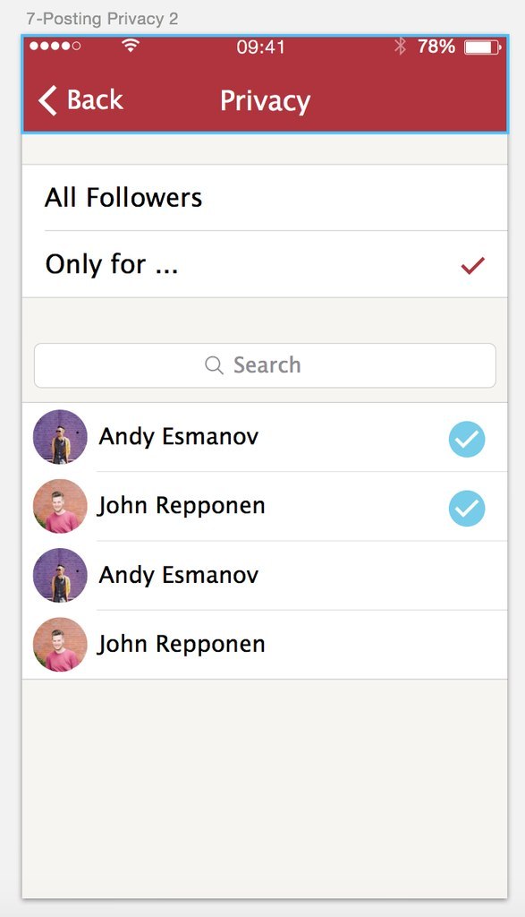
Good afternoon. There was a dispute over the design of the application: some want to make checkboxes heterogeneous and different, like here: 
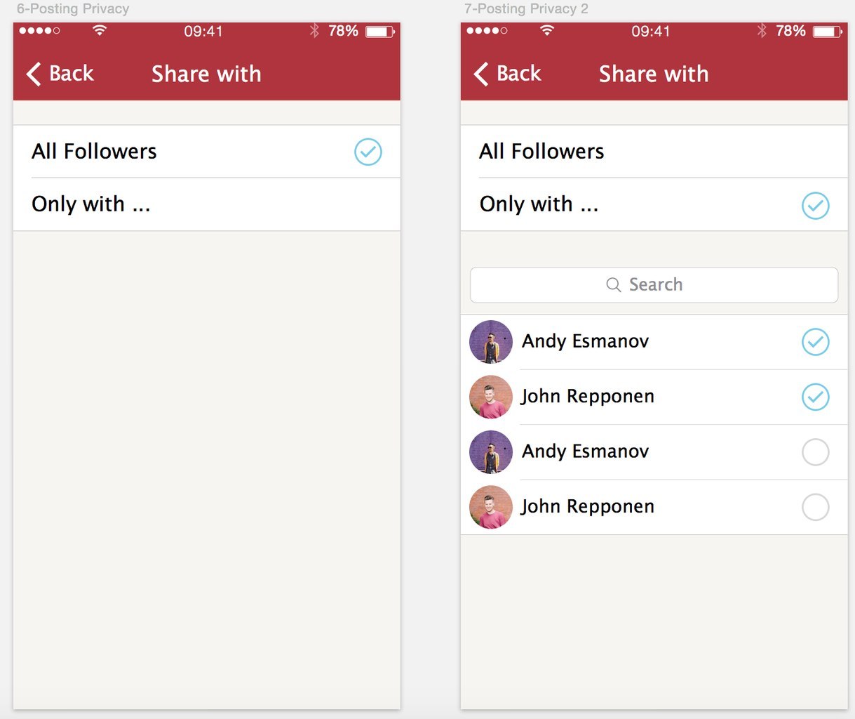
Others like here: 
Help me choose the best solution and are we moving in the right direction? Please, as much as possible criticism and, if desired, advice.
Thank you in advance!
Answer the question
In order to leave comments, you need to log in
If you are designing only for iPhones, then it is better to stick to the standard checkbox from the guides, because the design of ios 8 is reduced to minimalism. Simple and clear.
Design unification is a good thing, either do it this way or that way. A mixture of styles is not always good. Either everything is in circles, or just standard checkmarks.
If these are secondary screens with the main share function, then leave simple checkboxes and do not bother.
It's just a prettier checkmark. Why all sorts of circles around her? Simplicity is needed, not sophistication.
Didn't find what you were looking for?
Ask your questionAsk a Question
731 491 924 answers to any question