Answer the question
In order to leave comments, you need to log in
Why is the media query not working properly?
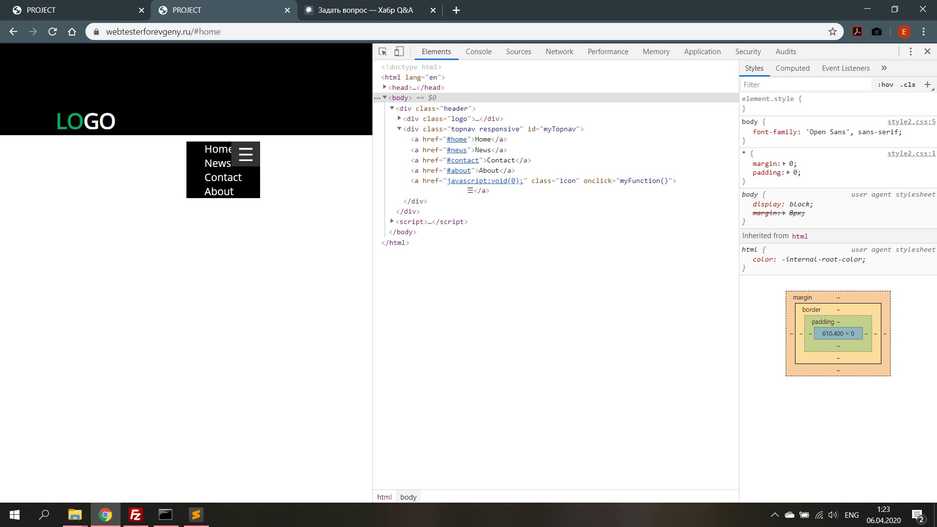
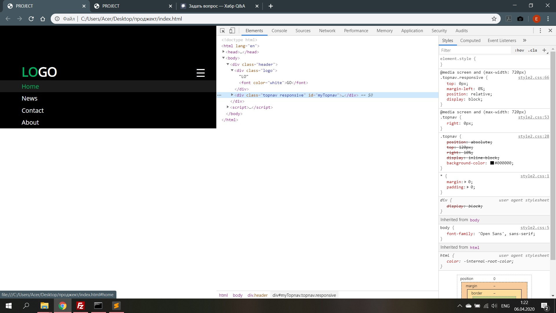
After uploading files to the host, the drop-down menu on click is displayed incorrectly, but on the PC everything is displayed as it should. Interested in the moment when the menu is expanded, i.e. clicked with the mouse.
<!DOCTYPE html>
<html lang="en">
<head>
<meta charset="UTF-8">
<meta name="viewport" content="width=device-width, initial-scale=1">
<title>PROJECT</title>
<link rel="stylesheet" href="style2.css">
<link href="https://fonts.googleapis.com/css?family=Open+Sans&display=swap" rel="stylesheet">
</head>
<body>
<div class="header">
<div class="logo">LO<font color="white">GO</font></div>
<div class="topnav" id="myTopnav">
<a href="#home">Home</a>
<a href="#news">News</a>
<a href="#contact">Contact</a>
<a href="#about">About</a>
<a href="javascript:void(0);" class="icon" onclick="myFunction()">
☰</a>
</div>
</div>
<script>
function myFunction() {
var x = document.getElementById("myTopnav");
if (x.className === "topnav") {
x.className += " responsive";
} else {
x.className = "topnav";
}
}
</script>
</body>
</html>*{
margin: 0;
padding: 0;
}
body{
font-family: 'Open Sans', sans-serif;
}
a{
text-decoration: none;
}
.header {
position: fixed;
width: 100%;
height: 150px;
background-color: #000000;
z-index: 1;
}
.logo {
display: inline-block;
margin-left:10%;
margin-top:102px;
color: #00B060;
font-size: 35px;
font-weight: 600;
z-index: 2;
background-color: #000;
}
.topnav {
position: absolute;
top: 120px;
right:10%;
display: inline-block;;
background-color: #000000;
}
.topnav a {
position: relative;
float: left;
display: block;
color: #ffffff;
text-align: center;
padding: 0px 30px;
text-decoration: none;
font-size: 17px;
}
.topnav a:hover {
transform: scale(1.15,1.15);
color: #00B060;
}
.topnav .icon {
display: none;
}
@media screen and (max-width: 720px) {
.topnav {
right: 0px;
}
.topnav a {
display: none;
}
.topnav a.icon{
display: inline-block;
position: absolute;
right: 0px;
top: -11px;
font-size: 30px;
}
.topnav.responsive {
top:0px;
margin-left:0%;
position: relative;
display: block;
}
.topnav.responsive a {
float: none;
display: block;
text-align: left;
padding: 5px 0 5px 10%;
}
.topnav.responsive a:hover {
transform: scale(1,1);
color: #00B060;
background-color: #1B1B1B;
}
.topnav.responsive a.icon {
display: inline-block;
position: absolute;
right: 0px;
top: -41px;
font-size: 30px;
padding: 0 30px;
}
}Answer the question
In order to leave comments, you need to log in
Didn't find what you were looking for?
Ask your questionAsk a Question
731 491 924 answers to any question