Answer the question
In order to leave comments, you need to log in
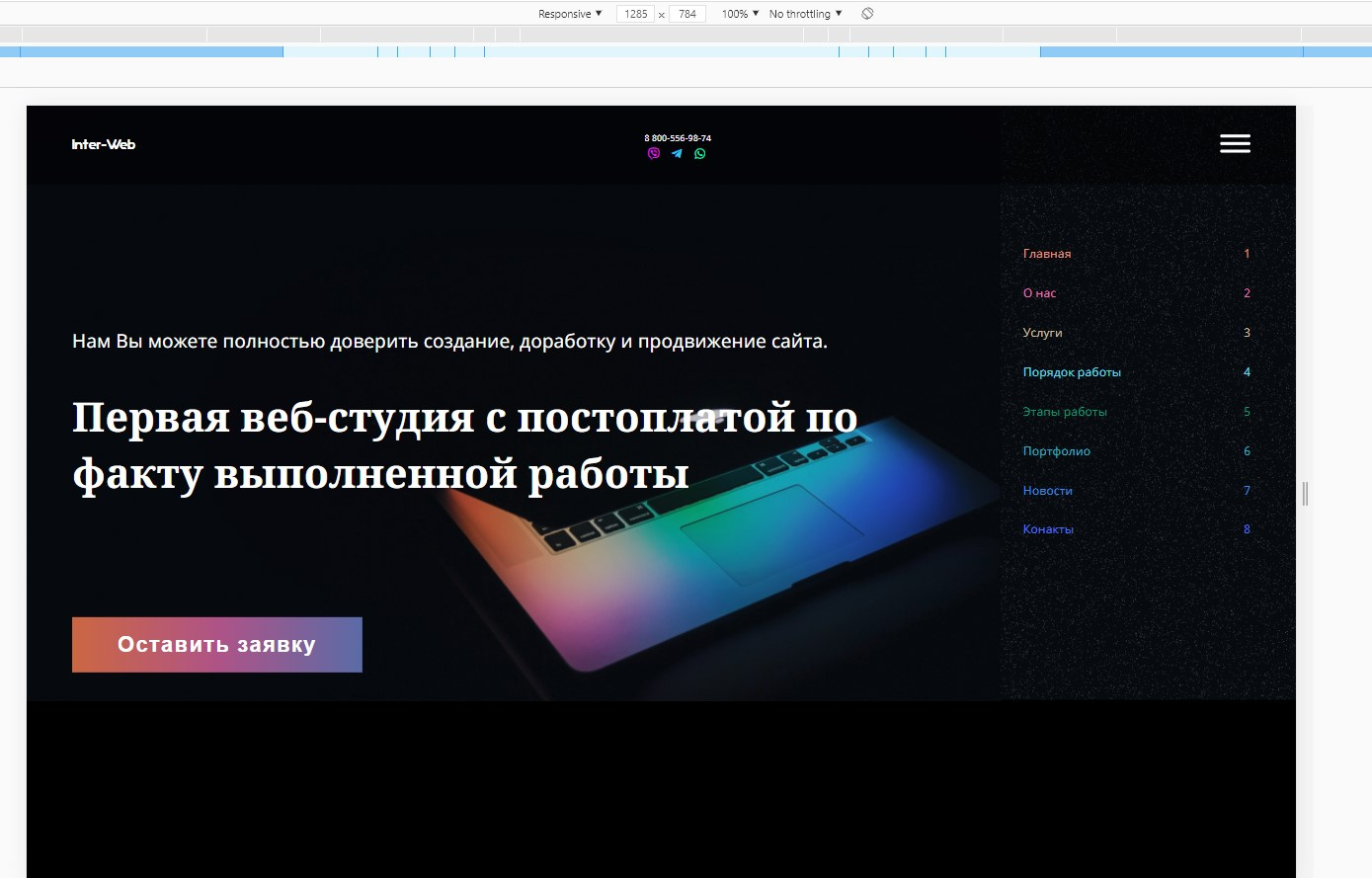
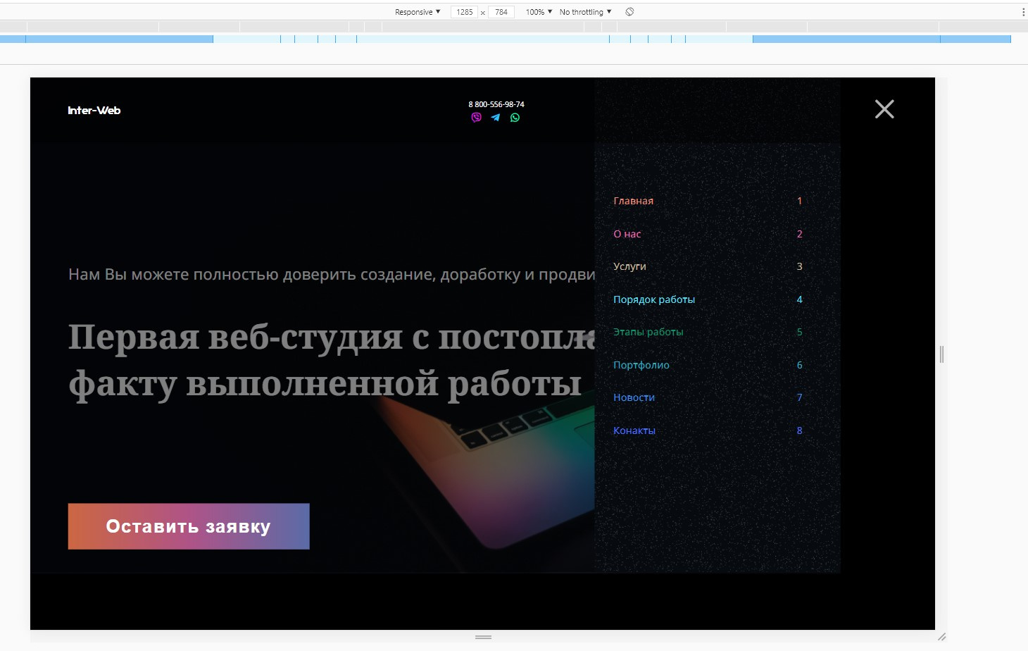
Why doesn't the hamburger menu hide, but lengthen the header?
With a screen resolution of 1300px, I get a burger to call the adaptive menu, but for some reason it does not hide, but lengthens the page, creating a horizontal scroll. I added a transform: translateX(100%) property to .menu-open so that it would not be visible and would only show up when the hamburger_wrapper was clicked by adding a .menu-open-active class with a transform: translateX(0%) property. But for some reason the menu leads out of bounds and behaves inappropriately. What is the problem?
<header>
        <div class="wrapper">
            <div class="content">
                <a href="#" class="logo">
                    Inter-Web
                </a>
                <nav class="menu">
                    <ul>
                        <li><a href="#">Главная</a>
                            <ul class="sub_menu">
                                <li><a href="#">Брендинг</a></li>
                                <li><a href="#">Вэб-разработка</a></li>
                                <li><a href="#">Медиа-маркетинг</a></li>
                                <li><a href="#">Комплексное<br>продвижение</a></li>
                            </ul>
                        </li>
                        <li><a href="#">О нас</a></li>
                        <li><a href="#">Услуги</a>
                        <li><a href="#">Порядок работы</a></li>
                        <li><a href="#">Этапы работы</a></li>
                        <li><a href="#">Портфолио</a></li>
                        <li><a href="#">Новости</a></li>
                        <li><a href="#">Конакты</a></li>
                    </ul>
                </nav>
                <div class="contacts">
                    <div class="phone-block">
                        <a class="number" href="tel:88005569874">8 800-556-98-74</a>
                        <button class="request open-popup">Заказать звонок</button>
                    </div>
                    <div class="social-block">
                        <i class="fab fa-viber"></i>
                        <i class="fab fa-telegram-plane"></i>
                        <i class="fab fa-whatsapp"></i>
                    </div>
                </div>
                <div class="hamburger_wrapper">
                    <div class="hamburger hamburger--spin">
                        <div class="hamburger-box">
                            <div class="hamburger-inner"></div>
                        </div>
                    </div>
                </div>
            </div>
        </div>
    </header>
    <div class="menu-open">
        <ul>
            <li><a href="#">Главная</a>1</li>
            <li><a href="#">О нас</a>2</li>
            <li><a href="#">Услуги</a>3</li>
            <li><a href="#">Порядок работы</a>4</li>
            <li><a href="#">Этапы работы</a>5</li>
            <li><a href="#">Портфолио</a>6</li>
            <li><a href="#">Новости</a>7</li>
            <li><a href="#">Конакты</a>8</li>
        </ul>
</div>@media screen and (max-width: 1300px) {
.bg_show {
display: block;
}
.menu {
display: none;
}
.request {
display: none;
}
.contacts {
flex-direction: column;
}
.contacts a.number {
margin-right: 0;
font-size: 12px
}
.fab.fa-viber {
margin-left: 0;
}
.menu-open {
display: block !important;
position: absolute !important;
background: url(../img/menu-bg.jpg) center no-repeat;
background-size: cover;
right: 0;
top: 0;
width: 300px;
height: 100%;
transform: translateX(100%);
transition: 0.3s;
padding: 0 60px 0 30px;
}
.menu-open-active {
transform: translateX(0%);
}
.menu-open ul {
display: flex;
flex-direction: column;
justify-content: center;
align-content: space-between;
height: 100%;
width: 100%;
}
.menu-open ul li {
display: flex;
justify-content: space-between;
margin-bottom: 30px
}
.hamburger_wrapper {
display: inline-block;
z-index: 999 !important;
}
.main .content {
padding-left: 0;
}
}
Answer the question
In order to leave comments, you need to log in
Didn't find what you were looking for?
Ask your questionAsk a Question
731 491 924 answers to any question