Answer the question
In order to leave comments, you need to log in
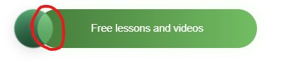
How to change the color at the intersection of objects?
I have two objects: a circle and a button.
When hovering over the button, it moves to a circle and should change color at the intersection.
I did it via mix-blend-mode, but you can't set your own color at the intersection using it.
How can this be implemented?
https://codepen.io/bogdandomashenko/pen/gOgLrjB
Answer the question
In order to leave comments, you need to log in
Let me expand on my previous answer with an example:
<div class="wrapper">

  <div class="button">
    <div class="button__circle">
      <div class="button__circle-shadow"></div>
    </div>
    <div class="button__body">Button</div>
  </div>

</div>$circle-size: 50px;
$transition: 0.3s;
$base-shift: translateX(-$circle-size * 0.25);
$hover-shift: translateX(-$circle-size * 0.75);
$circle-color: #F79854;
$button-color: linear-gradient(90deg, #427C33 0%, #6EBC5A 100%);
$blend-color: mix(#F79854, #427C33);
.wrapper {
width: 500px;
height: 500px;
display: flex;
align-content: center;
justify-content: center;
}
.button {
$block: &;
height: $circle-size;
display: flex;
cursor: pointer;
&__circle,
&__circle-shadow {
height: $circle-size;
width: $circle-size;
border-radius: 50%;
}
&__circle {
position: relative;
z-index: 2;
background: $circle-color;
overflow: hidden;
}
&__circle-shadow {
position: absolute;
left: 100%;
background: $blend-color;
transition: $transition;
transform: $base-shift;
#{$block}:hover & {
transform: $hover-shift;
}
}
&__body {
height: $circle-size;
width: $circle-size * 6;
display: flex;
align-items: center;
justify-content: center;
color: white;
background: $button-color;
border-radius: $circle-size;
transition: $transition;
transform: $base-shift;
#{$block}:hover & {
transform: $hover-shift;
}
}
}Simply styles - in any way. See what property is used in the layout source, then use it for mix-blend-mode
To achieve the desired effect, place another circle inside the circle and move it. Well, do not forget about the z-index, so that the circle has more than the long button.
Didn't find what you were looking for?
Ask your questionAsk a Question
731 491 924 answers to any question