Answer the question
In order to leave comments, you need to log in
Why does the screen width not match when layout on a laptop and a computer in the explore element?
Я верстаю на ноутбуке(1366x768px) и компьютере(1920x1080). Сверстал макет без адаптива на компьютере. Когда включаю его на ноуте и в исследовать элемент в responsive выставляю 1920, то вижу не то, что видел на мониторе компьютера. Вопрос почему? Я думал responsive в исследовать элемент создан для таких ситуаций. Я сделал часть макета на компе и сейчас мне нужно доделать его на ноутбуке, но понимаю, что так будет неправильно. Вот что я вижу с ноутбука 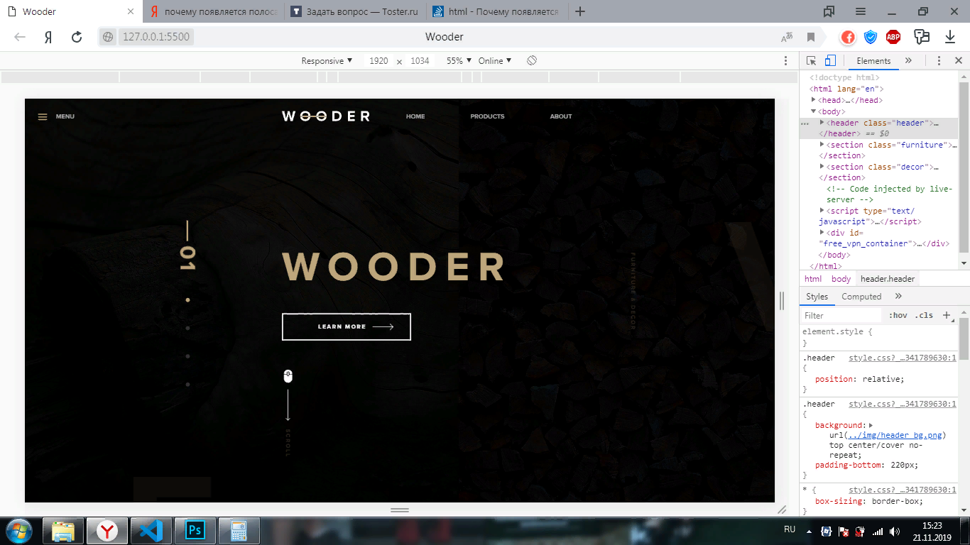 , причем сайт скролится вправо:
 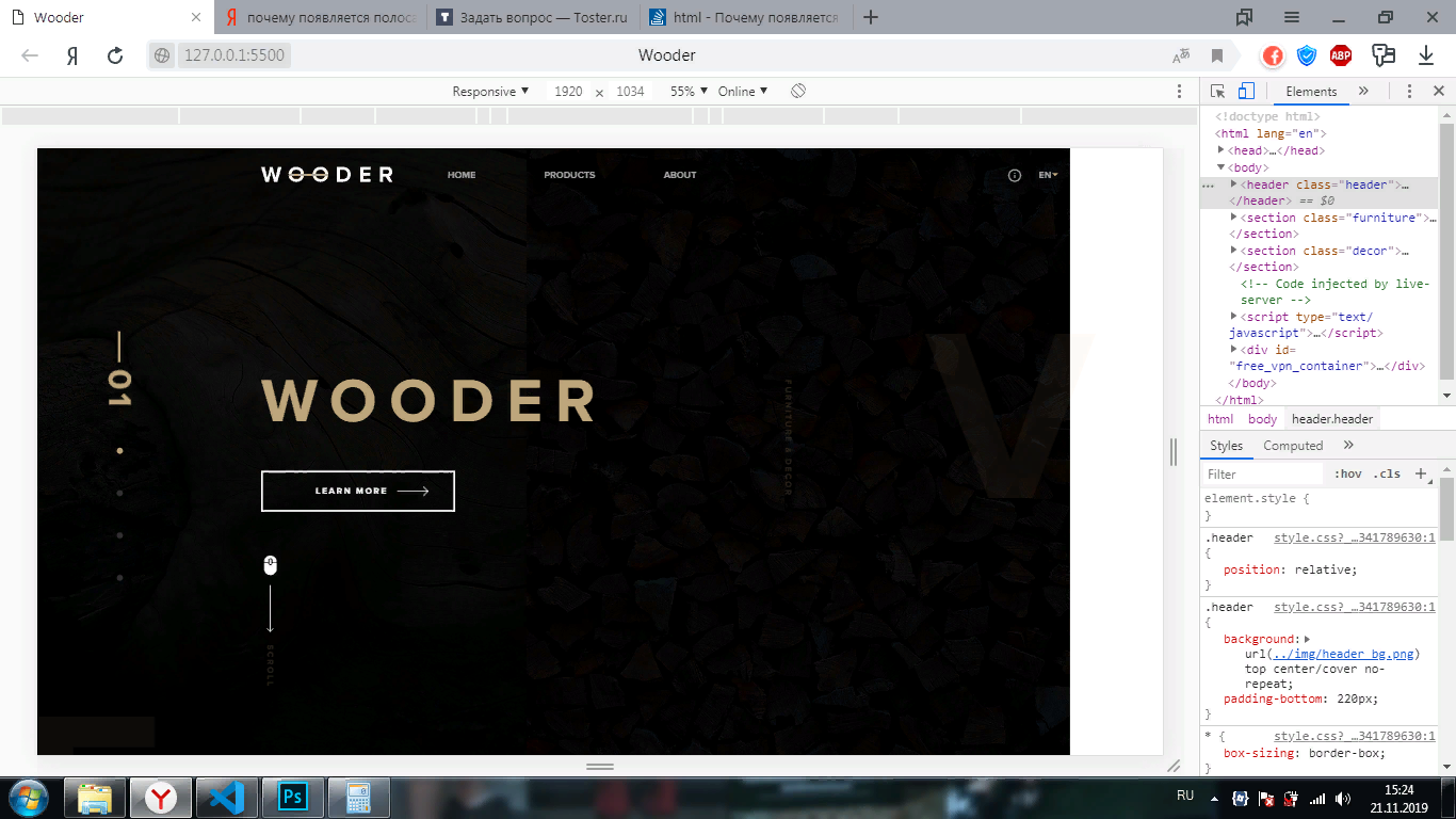 . Что делать?
Answer the question
In order to leave comments, you need to log in
Found the problem. In my explore element in the hidden menu, the mobile version was by default for some reason: 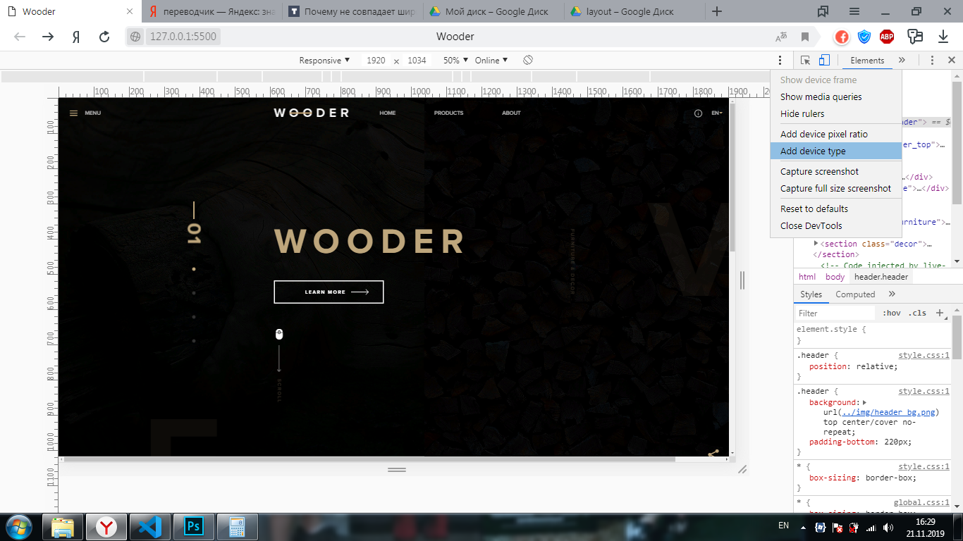
That's just the horizontal scroll bar left, it's not on the computer. I know that it exists due to the fact that the content of the sections goes beyond their limits due to positioning, but why is it not on the computer? And whether it is necessary to fix this if there is no problem on the 1920 monitor, but on, let's say, an emulator like explore the element, this is the question.
Тут исходники посмотреть бы... Можете на ЯД выложить или куда-то?
Didn't find what you were looking for?
Ask your questionAsk a Question
731 491 924 answers to any question