Answer the question
In order to leave comments, you need to log in
Why are multiple media queries applied at once?

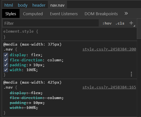
Wrote media queries one after the other (from mobile to laptop 320px - 1024px), however the styles of the higher resolutions affect the styles of the smaller ones. What is the problem?
Here is an example media query:
@media (max-width: 425px) {
  .nav {
    display: flex;
    flex-direction: column;
    padding: 10px;
    width: 100%;
  }
  header {
    background: url(/img/header/bg_header.png) no-repeat bottom/125%;
    background-color: #eceef4;
    height: 100%;
    display: flex;
    .nav__item {
      //отступ между элементами
      margin-bottom: 17px;
      font-family: "Lato";
      font-size: 20px;
      font-weight: 700;
      text-transform: uppercase;
      letter-spacing: 0.2em;
      color: #4d4959;
      text-align: center;
      order: 2;
    }
    .logo {
      order: 1;
      margin: 0 auto;
      //отступ от логотипа
      margin-top: 10px;
      margin-bottom: 30px;
      img {
        width: 5em;
      }
    }
  }
}Answer the question
In order to leave comments, you need to log in
Don't override properties that don't change.
Why do you set the flex 2 times (I'm afraid even that not 2), if the block has remained flex as it was? The rest of the properties are similar.
Those. in the example from the screenshot, the second media group is not needed at all, because nothing has changed at all.
Remember the inequalities at school. It's the same here.
A window width of 300 hits both conditions. Accordingly, both styles are applied and those and those.
The browser seems to ignore the media brackets and calculate specificity as normal.
Most likely, your media queries are listed in the wrong order, respectively, the lower ones interrupt the upper ones. In addition, today the mobile-first layout is considered more correct, that is, the styles go from mobile first, then for media queries from smaller to larger, and the conditions go to media ( min-width : XXXpx){}
Didn't find what you were looking for?
Ask your questionAsk a Question
731 491 924 answers to any question