Answer the question
In order to leave comments, you need to log in
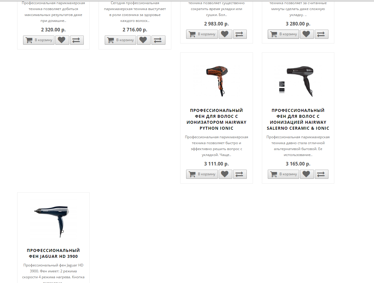
Why are goods crooked?
There is a standard oc 2.0 template, but the products in the categories are displayed crookedly, because of what could this be?
Answer the question
In order to leave comments, you need to log in
Because the product cards are all laid out using float. And, if their height is different, as can be seen in the picture, then they knock out those that lie under them. This is how floats work. Use inline-block, flexbox, or give all blocks the same height. And better limit the height of the title and description of the product using a fixed height + overflow: hidden. And also, to the last paragraph, you can add this property
On SCSS it will be like this:
@mixin justifyBlocks {
    text-align: justify;
    font-size: 0;
    line-height: 0;

    &:after {
        content: '';
        display: inline-block;
        width: 100%;
    }
}> div {
display: inline-block;
vertical-align: top;
}Didn't find what you were looking for?
Ask your questionAsk a Question
731 491 924 answers to any question