Answer the question
In order to leave comments, you need to log in
Who can suggest a good solution for the design of the "where to buy" block?
A blog site that describes, among other things, the use of various products. The link to the product is given in the article. On the product description page there are links to stores where this product is sold. The design is minimalistic: name, characteristics, picture, no graphic elements. I want to beautifully enter links to pages where you can buy a product, but it turns out something is wrong: either the links are lost and look like text, or they are too conspicuous and distracting.
I searched forums on design and interfaces, but could not find anything. Maybe someone will tell you a ready-made solution or indicate the way where you can look?
Answer the question
In order to leave comments, you need to log in
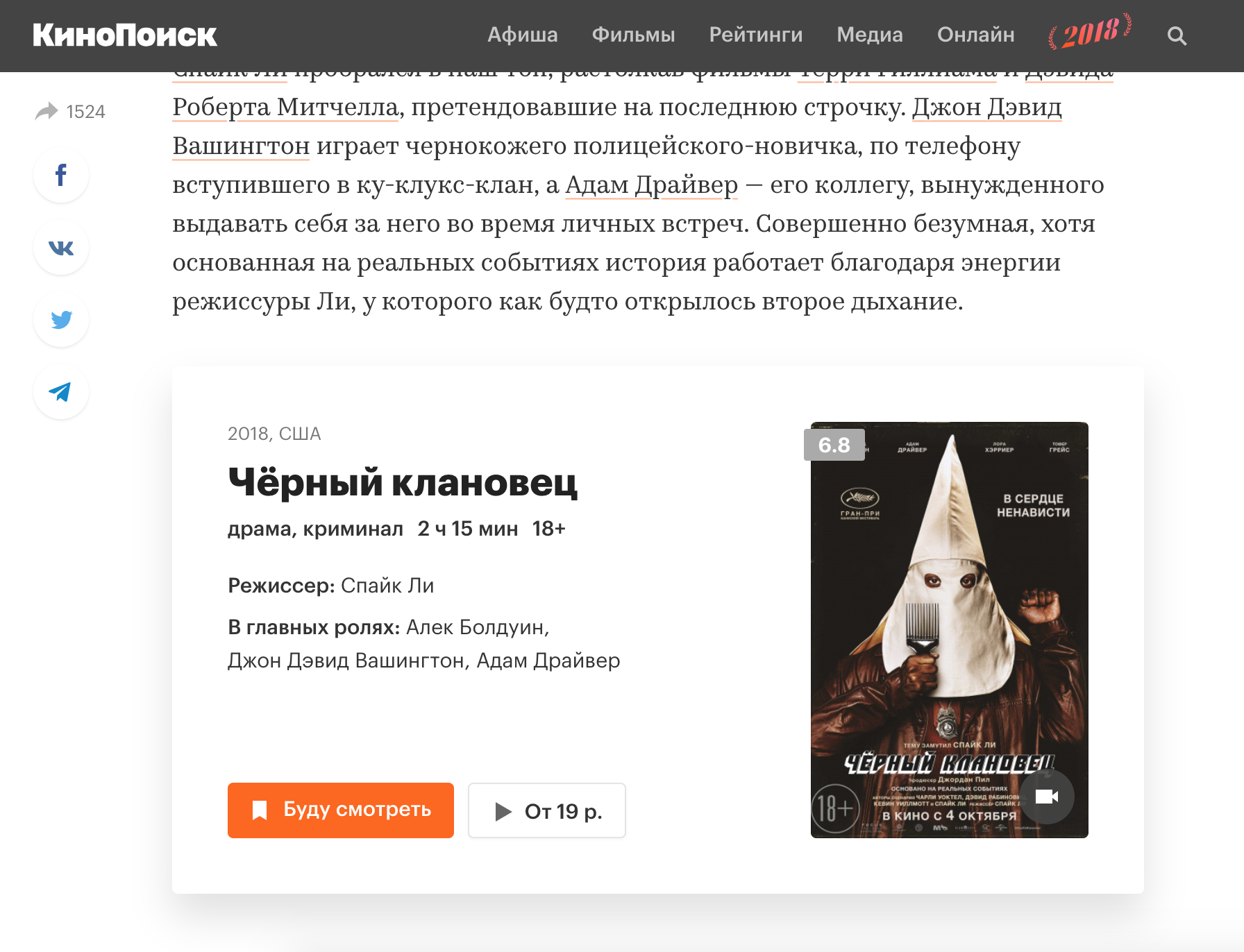
You can make up some kind of tie-in with a product card, something like on Kinopoisk :
Didn't find what you were looking for?
Ask your questionAsk a Question
731 491 924 answers to any question