
Answer the question
In order to leave comments, you need to log in
Answer the question
In order to leave comments, you need to log in
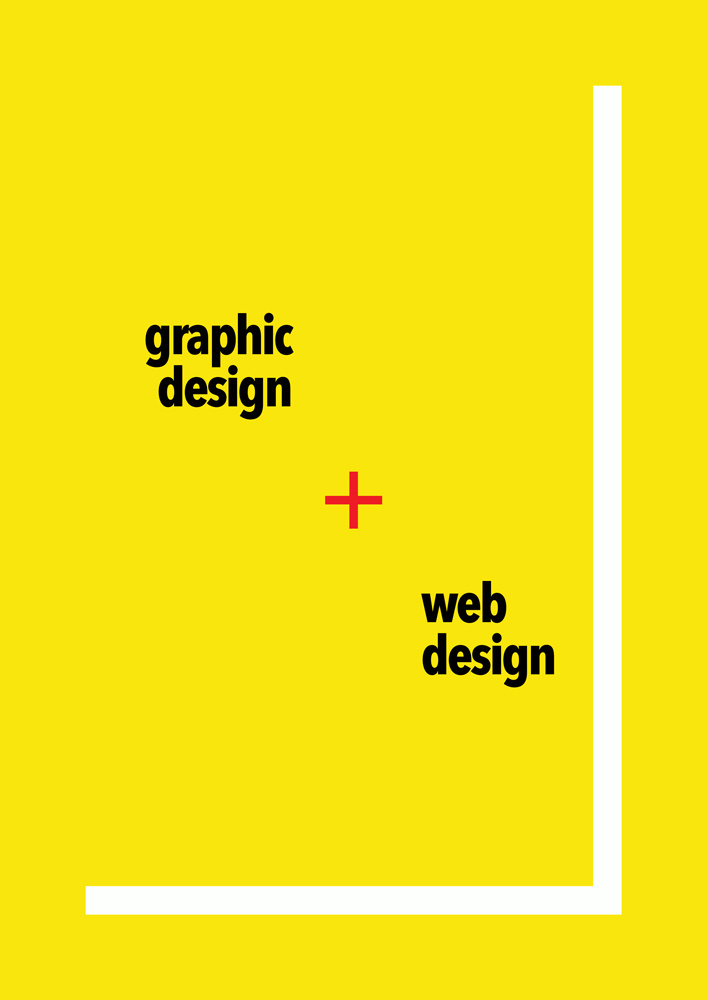
Why is design under graphic centered and under web left?
The first option is better than the others.
Reason: The fact is that we have a common canvas, limited by white frames that look whole with the canvas. Two black inscriptions act as two objects, they are stable, cold, calm, because black color. Between them is a red addition cross. You focus on the addition of these two objects. But the objects themselves are just as important in your composition as they have saturation.
______
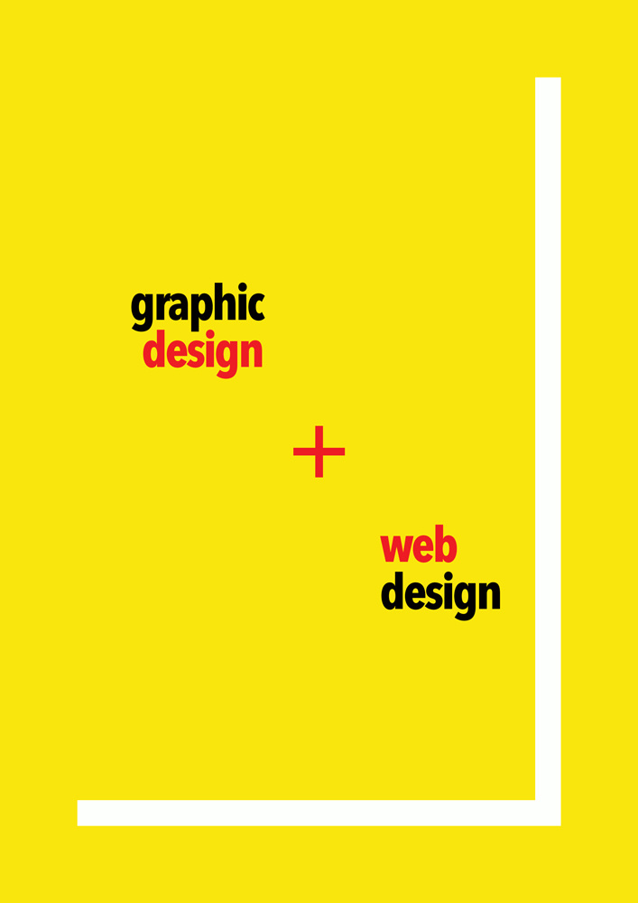
In general, all the pictures are not very literate in color and composition, because you did not show the center of the composition, the white frames interfere, the black inscriptions stick to the frames. Linked objects are inarticulate at all. Revisit this moment...
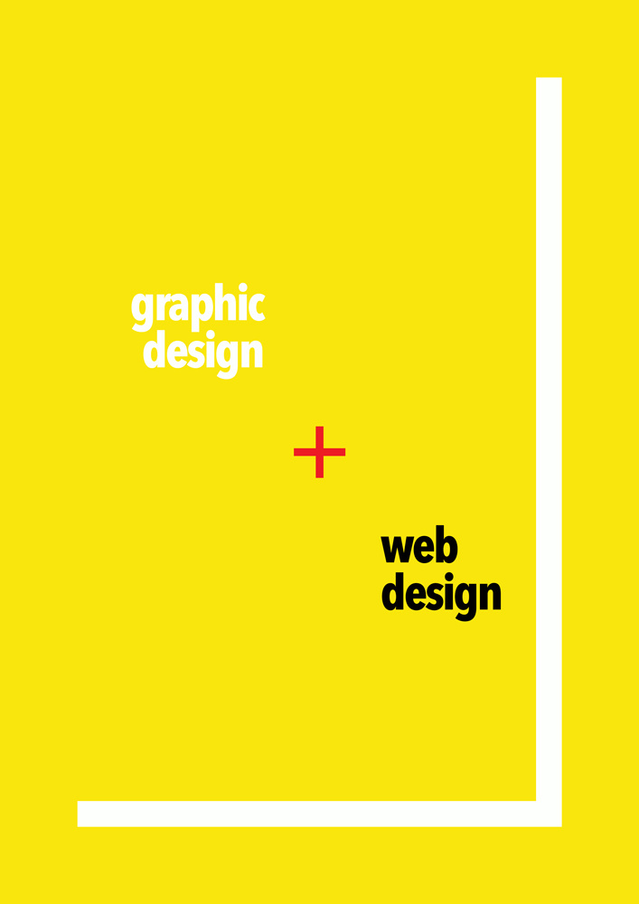
The saturation of the color should vary depending on the importance of the object or your desire to show the accent. In your case, you took pure colors, the accent is red... But the color scheme is long gone... Look at the palettes of modern interfaces. Now your color scheme is aggressive, just throws itself at us with foam at the mouth and screams in our faces. Choose a more benevolent shade for the background, such as a delicate light green. Let your inscriptions be, let's say, white, but your cross can already be red, but not squealing red, but gone gray and white, there, for example (my example, just my IMHO, but the rattling acid gamma should definitely be removed)) Or just warmer than the background color, like orange. Avoid acid colors...) Good luck to you)
Didn't find what you were looking for?
Ask your questionAsk a Question
731 491 924 answers to any question