Answer the question
In order to leave comments, you need to log in
Which logo is more correct?
I can't figure out which looks better. The upper one, in which the letter R is more oblique, but at the same time its angle of inclination is stronger than that of the first letter A. Or the second one, where the angle of inclination of both letters is the same? Does it make sense to use the first option or is it wrong? Thanks for the help.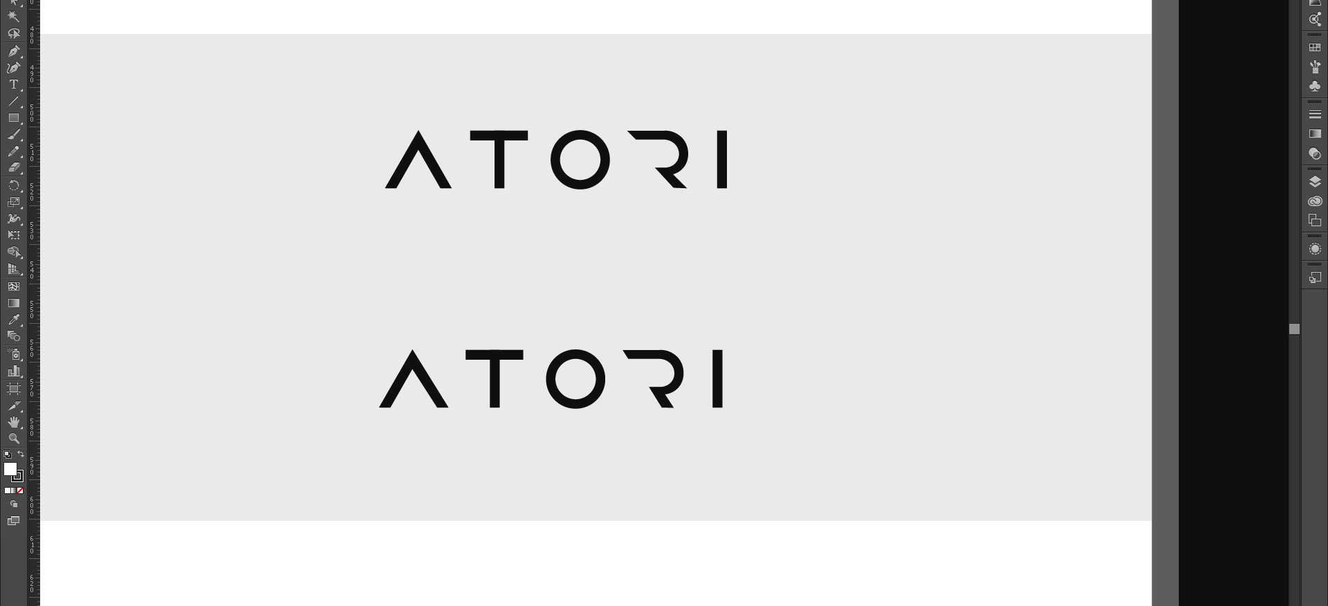
Answer the question
In order to leave comments, you need to log in
Because the letters are not side by side, the strict parallelism of the slanted is not as important
as the visual balance of the empty space to the left and right of the letter "O".
it's better when there is parallelism - then you get a rhyme,
but in general the logo is shit, because there is no idea, very weakly
just cut off a piece of the letter - this is not a design, this is a typographic castration
. a crowd, nothing good can be done by a crowd - a Russian person has not been able to understand this for 1000 years, you need to hire talented dizers and pay them well, that is, appreciate them, but a Russian person traditionally does not appreciate his designers and engineers, and therefore everything is in his back place, well, except for the military - they have order and they know how to make a good product
Didn't find what you were looking for?
Ask your questionAsk a Question
731 491 924 answers to any question