Answer the question
In order to leave comments, you need to log in
Where is the best place to place error and success notifications?
Hello!
There is a project that includes a large number of forms and other functions where one or another check is implemented with the issuance of a result.
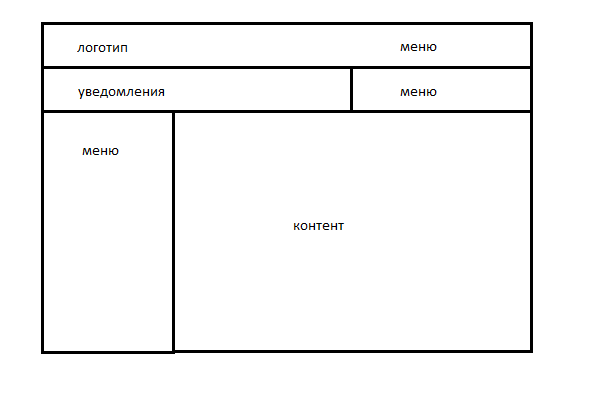
The template is built as follows: 
I would like to notify the user of all errors and successes through pop-up messages.
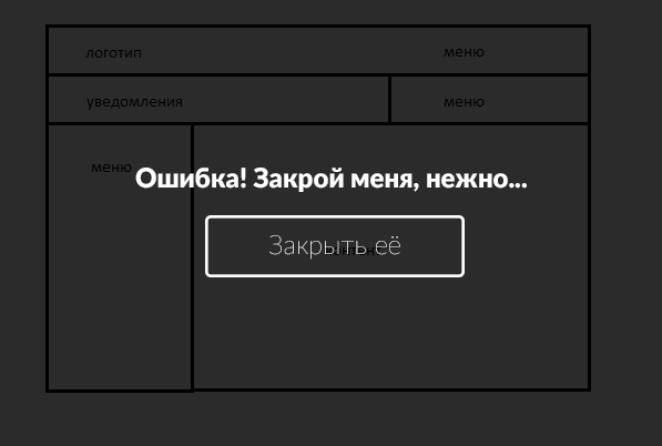
At the moment, these notifications appear on the entire page: the background is darkened and the text of the error or success messages is in the foreground, but in the course of development and testing I was terribly fed up with these messages that you need to constantly close in order to continue working with the site.:
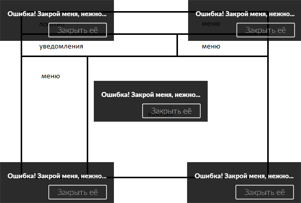
The question arose - where is it better to place these messages, in which corner of the site? The upper left corner disappears - there is a logo, the upper right - the menu, will block, the lower left - Oo, the lower right - as an option, but in my opinion not the best place for errors: 
How do you feel about full-screen notifications with background dimming? Perhaps I have already seen enough of them, but the user can also get bored with them and he will leave ...
Answer the question
In order to leave comments, you need to log in
Show notifications where the user looks, where the mouse cursor is held, that is, contextually.
Error notifications should disappear when the bug is fixed. Luck notifications should disappear on their own if the user stays on the page, or stay on the page if the user goes further from this page.
Didn't find what you were looking for?
Ask your questionAsk a Question
731 491 924 answers to any question