Answer the question
In order to leave comments, you need to log in
Where can I find chart design examples?
I made a page for displaying a graph of river levels for fishermen. Basically, no one complained. Fishermen somehow don't care about the design, the main thing is to be aware of when the flood begins and when the water begins to subside. But I don't really like something myself... The project is (probably loudly said) purely amateur, I myself have never dealt with layout and design.
Can you give me some hints or links to examples? This is what the page looks like. In advance, everyone - merci!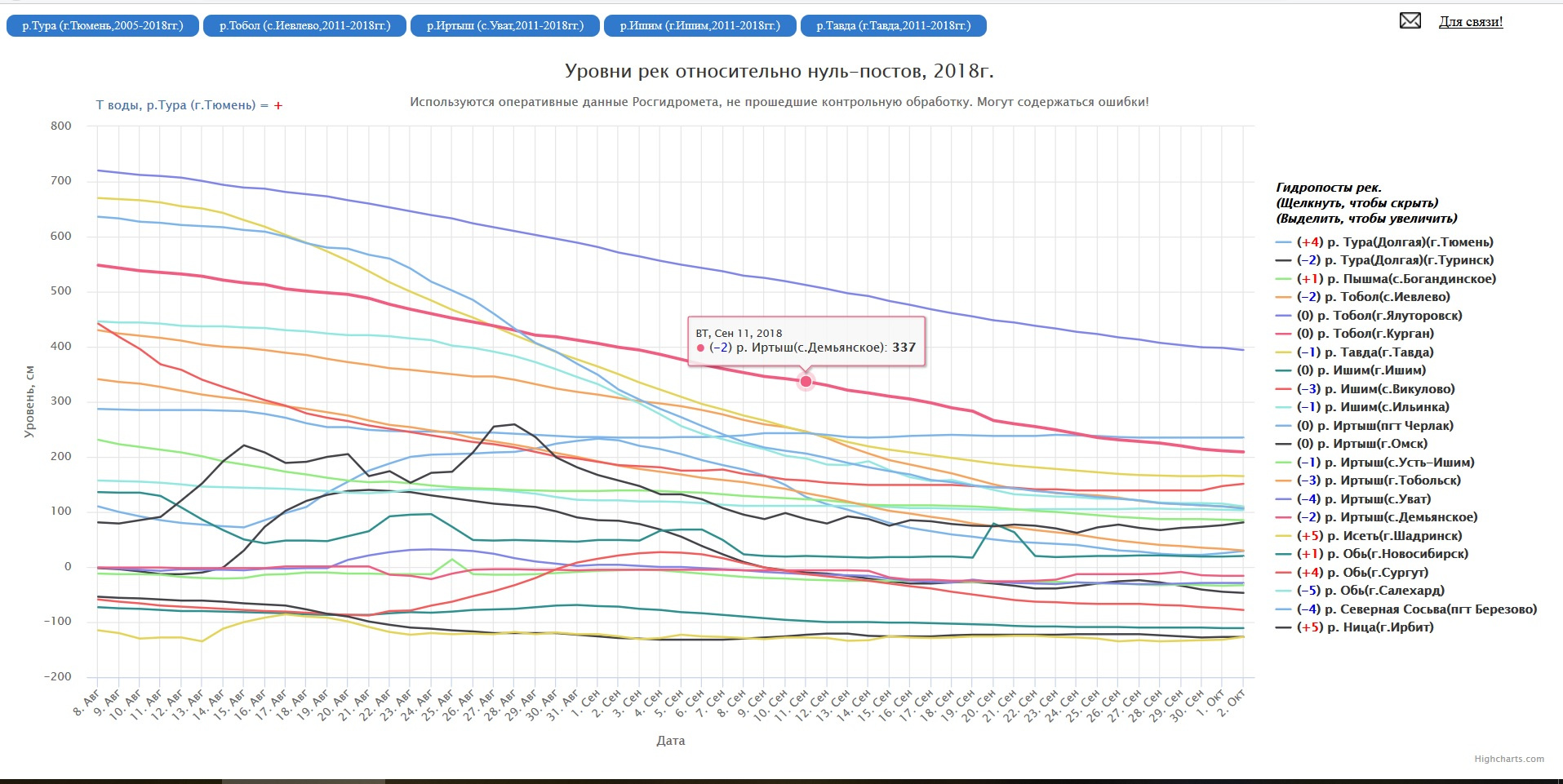
Answer the question
In order to leave comments, you need to log in
Hey, I'll do a quick review.
1) First, we quickly convert the current graph into figures, it is easier for an amateur to see the layout:
it is already clear that some elements are floating and not aligned.
2) Let's formulate and fantasize the benefit:
- immediately understand the approximate dates of floods and recessions
- help find information
- take into account the non-target audience: a student completes a geography assignment, a student writes a paper, etc.
- remove all unnecessary
3) We look at what can be improved:
Remove the mail icon. Exclamations are not needed! We remove! Better: Feedback. It is better to remove the feedback in the basement, it is hard to believe that it will be used at all when examining the graph.
Dates are repeated in tab buttons, everything that is repeated is always taken out of brackets. It is not clear why these rivers? Where are the others? Let's assume that they are the most popular and skip the moment for now.
Removing signs! The zero of the post is written like that, without a hyphen.
no: River levels relative to zero posts, 2018 The operational data of Roshydromet, which have not passed control processing, are used. May contain errors!
yes:
Water levels, see
Tura River near Tyumen
Data taken from zero posts by Roshydromet. The control processing was not passed, errors of 10..30 cm are allowed. (It is debatable whether this information should be shown at the beginning, or moved down after the graph, while we omit it)
Next, the block with the water temperature. As you can see, they are marked with color, we remove them, and so it is clear. It is not entirely obvious that we are talking about temperature when we look at the block of rivers on the right, so I propose to designate it as follows: -3 °С, +2 °С
We indicated the level in cm in the title, I believe that it can be removed. The month below is repeated, we remove the repetitions and put them out of brackets, leaving only the dates.
The porridge is colored, greasy and fancy. Let's simplify: sort in alphabetical order, take out the repetitions in brackets, tie the colors to the rivers, designate the temperature correctly, remove the heading.
In my opinion, in this pop-up, this should be the priority: exact number, river
,
date
,
etc.
colors need to be selected so that they differ in saturation, for example, I used random colors by changing the saturation, it is difficult to call my version accessible to people with visual impairments. I believe that each river can have its own color-marker and dance from it.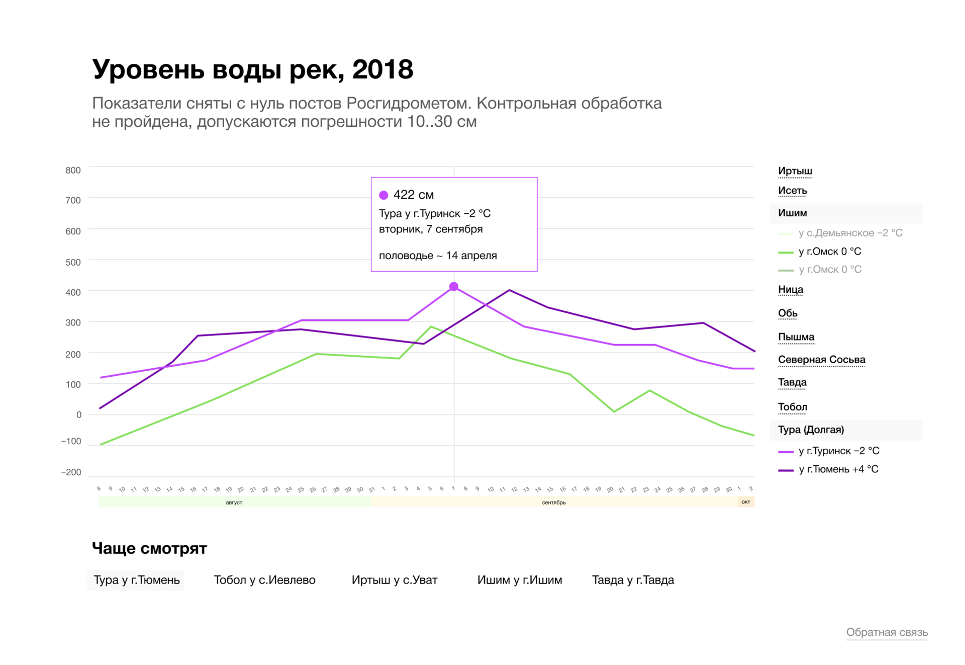
Didn't find what you were looking for?
Ask your questionAsk a Question
731 491 924 answers to any question