Answer the question
In order to leave comments, you need to log in
When adapting a site for mobile devices in @media queries, how to prescribe classes?
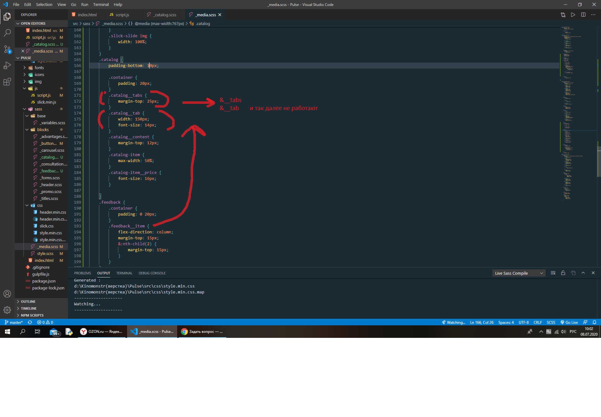
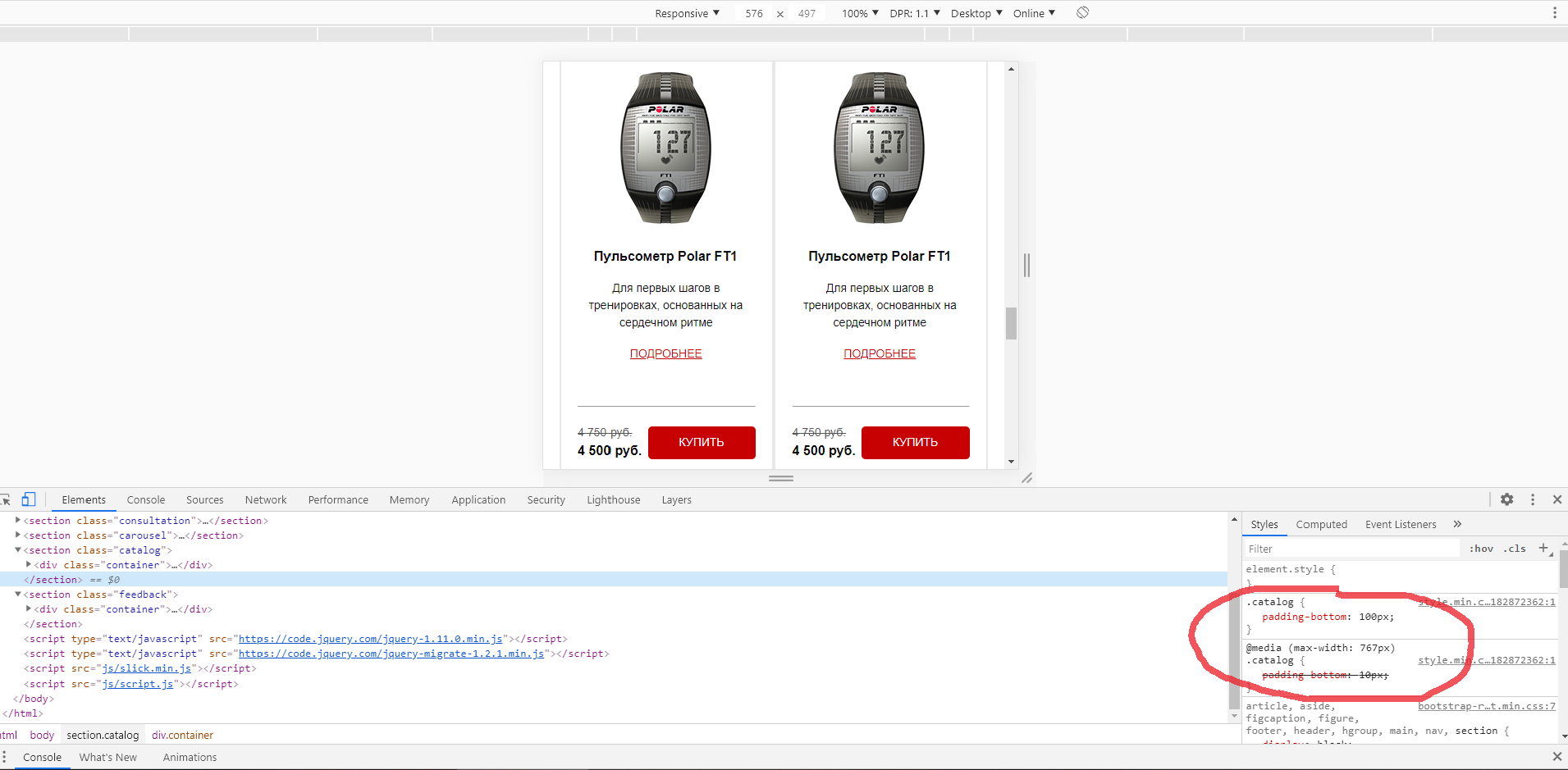
Hello! Please help a novice colleague) When adapting a site for mobile devices (typed using BEM, Vs-code, gulp, scss), I encountered the fact that properties of some classes are not inherited in media queries if I prescribe through &, so I have to prescribe the class completely, this is one task, and the second is that some sections do not change properties during adaptation (specifically Padding and remain crossed out when I look in the developer tools, inheriting from the desktop version. What can be? Please help!


Answer the question
In order to leave comments, you need to log in
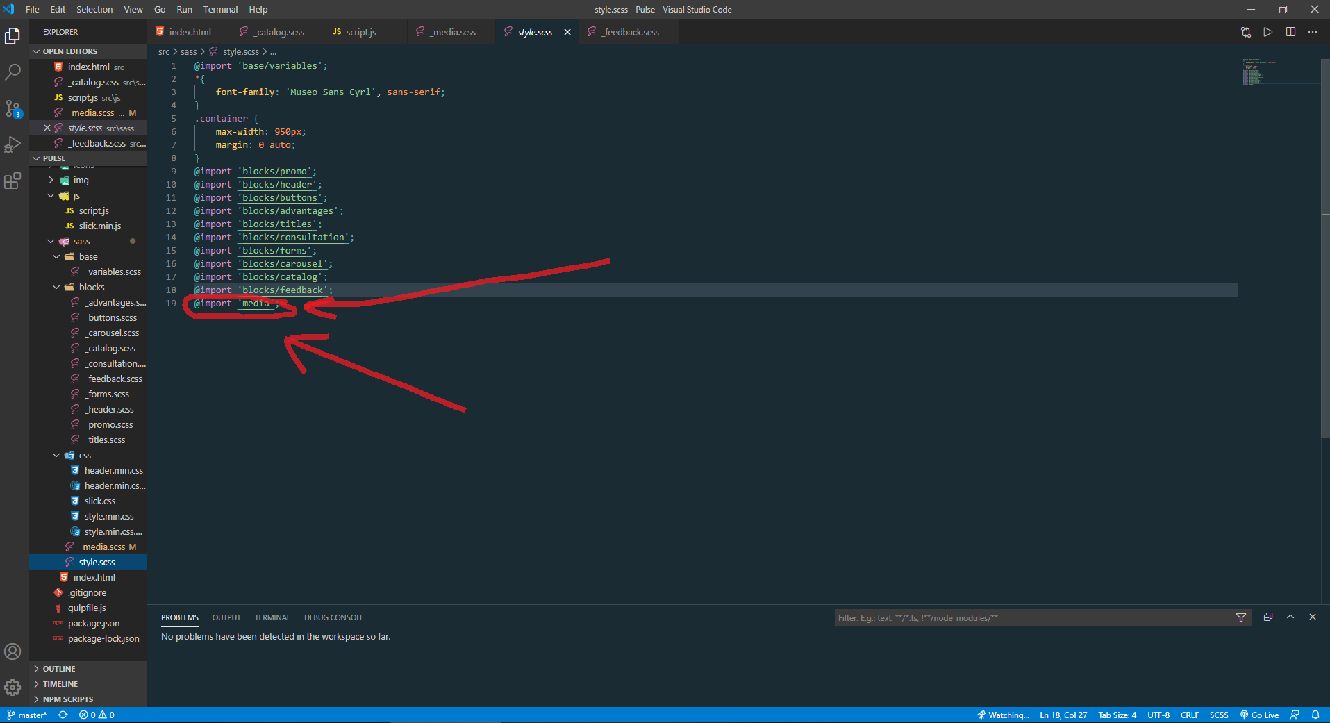
Thanks Andrew . The main problem was that in the style.scss file, the media block was not included at the very end. When you move it to the end, all the styles on adaptation are applied and work fine.

Didn't find what you were looking for?
Ask your questionAsk a Question
731 491 924 answers to any question