Answer the question
In order to leave comments, you need to log in
How to use vertical rhythm correctly with Compass?
The other day I decided to try the vertical rhythm in the compass and immediately ran into trouble.
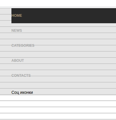
Let's say we specified the font size and leading through a variable and connected a mixin that includes a vertical rhythm. The text on the page looks good and fits within the vertical lines rendered by the debug-vertical-alignment mixin.
But I decided to make a vertical menu: I made the links in blocks, added indents so that they looked like buttons. Of course, the text now does not fall under the vertical lines. 
This is fine? Maybe you should not pay attention to the vertical lines?
Answer the question
In order to leave comments, you need to log in
Watch father how to use vertical rhythm in compass https://www.youtube.com/watch?v=Leert-TnSSg
Didn't find what you were looking for?
Ask your questionAsk a Question
731 491 924 answers to any question