Answer the question
In order to leave comments, you need to log in
What to do with indents around text?
Layout question: there is some layout (this one was taken from the first site that came across, but it is relevant for everyone with printed text), it has a header with text on the right side. According to the layout, the indent from the top edge of the header to the phone number should be 45px , the width and height of the block with numbers and the inscription "feedback" should be 256px and 81px, respectively, based on the layout.
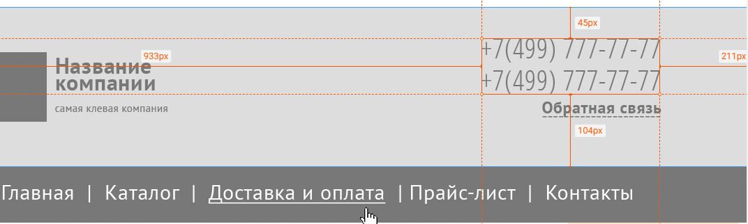
Implementation of a specific block with a phone and the inscription "feedback":
<header>
<div class="container">
<div class="contacts">
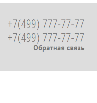
<span class="contacts__phone">+7(499) 777-77-77</span>
<span class="contacts__phone">+7(499) 777-77-77</span>
<span class="contacts__feedback">Обратная связь</span>
</div>
</div>
</header>@import url('https://fonts.googleapis.com/css2?family=Open+Sans+Condensed:ital,[email protected],300;0,700;1,300&display=swap');
@import url('https://fonts.googleapis.com/css2?family=PT+Sans:ital,[email protected],400;0,700;1,400;1,700&display=swap');
.container {
max-width: 980px;
margin: 0 auto;
display: flex;
justify-content: flex-end;
}
header {
padding: 45px 0 65px;
background-color: #ddd;
}
.contacts {
display: flex;
flex-direction: column;
text-align: left;
}
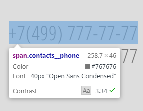
.contacts__phone {
font-family: 'Open Sans Condensed';
font-size: 40px;
font-weight: 300;
font-stretch: condensed;
line-height: 1.15;
letter-spacing: 1px;
color: #767676;
}
.contacts__feedback {
font-family: PTSans;
font-size: 24px;
font-weight: 900;
line-height: 1.92;
letter-spacing: 0.6px;
color: #767676;
}
Answer the question
In order to leave comments, you need to log in
A quick digression - typography on the web = pain. Enjoy. Nothing to do with printing, although I would like to.
Now in essence:
1. Edit special cases by hand. There are just a sea of opportunities here, from line-height: 1 (norms) to absolute positioning (bad).
2. Constantly and everywhere, so it is worth understanding the anatomy of fonts in order to know how to work with them. Well, yes, no Zeplin will give you this magic, since this is a program that simply transposes editor properties (read everything is absolutely positioned) into CSS types.
3. Yes, the main thing is not to shoot yourself in the foot while doing this. Those. most likely it is not worth it to resort to this.
4. It is important for the customer to make money on the project that you are implementing.
5. Yes, there is, such as Baseliner, or all sorts of plugins for applying a translucent picchi over the layout, but in general this is all from the evil one.
Didn't find what you were looking for?
Ask your questionAsk a Question
731 491 924 answers to any question