Answer the question
In order to leave comments, you need to log in
What is wrong with the design, what are the global errors?
The other day I accidentally stumbled upon the developer community of the Pale Moon browser . The design of their site seemed a little outdated to me and I asked at the conference if there was any reason to try to make an updated version - they gave the go-ahead and the work began to boil. 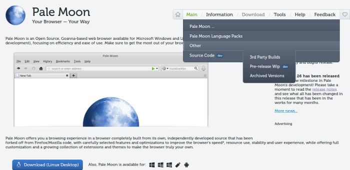
Today I finished the layout of the main page, as I see it in a more or less modern way. A lot of work has been done - the site received basic adaptability, a "sleek" flat and concise design, the main menu, which had to be tinkered with, but it was especially interesting, since this chip from the world of usability was personally applied.
A separate emphasis was placed on the lightness of the page - with all the graphics, HTML code and styles, it "weighs" about 70 kilobytes without compression.
Today I presented this page to the community, hoping to get, if not approval, then some constructive criticism. But he did not receive criticism, the ideologists of the project referred to the fact that “not our style”, “no individuality”, “too flat”, etc. In short, the guys threw rotten tomatoes and strongly opposed it. ;)
So, the main question - tell me, what global jambs I may have made in my work? Constructive criticism in terms of my art and technical part is interesting. I would like to raise the level in this interesting direction for me, but there are not enough reasonable indications of the main points, where something went wrong. In this regard, I would like a little feedback and analysis to correct further attempts and, in general, a “constructive exhaust” from a couple of sleepless nights.
All in all, here's the job., here I am, here you are, you have the floor and thank you in advance! :)
Answer the question
In order to leave comments, you need to log in
It's not about the technique, but about the client and the presentation)
At a minimum: 1 - read about leading,
2 - try to read the text on the site at a resolution of 1400px,
3 - You have a strange Museo style for a regular, bold does not differ much from it, the same Helvetian becomes an order of magnitude more readable.
4 - Two different icon sets
5 - Grid bug
6 - Resource doesn't do its job, main page looks like one spot, i.e. it doesn't focus on blocks, text is very difficult to read due to line width, you can continue, but I won't bother)
Didn't find what you were looking for?
Ask your questionAsk a Question
731 491 924 answers to any question