Answer the question
In order to leave comments, you need to log in
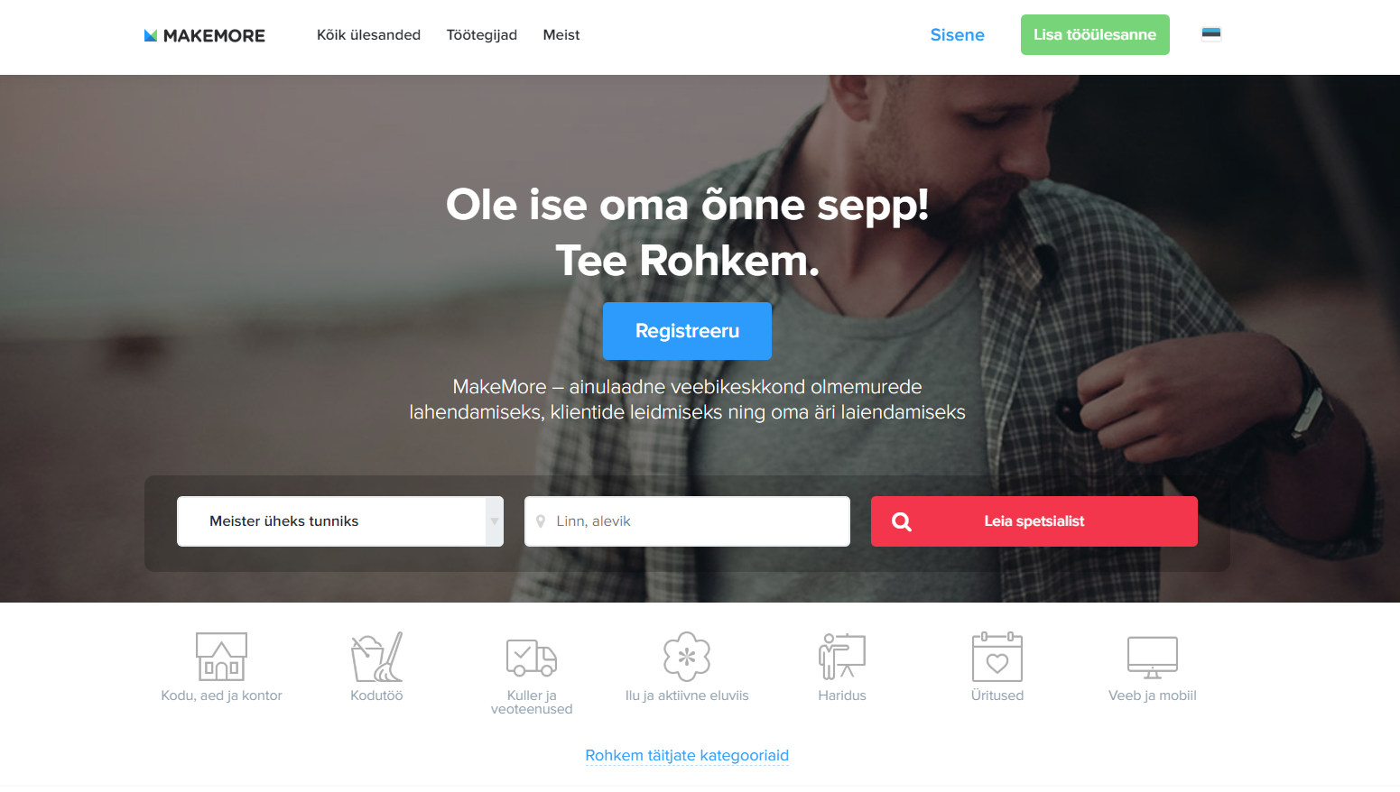
What is the style of this website design?
I like this kind of designs. Light light design, font, curves, colors, shapes... everything goes together superbly. What do I need to tell the designer to make a design with the same harmony?
It seems to me that there are a lot of sites of this type. That is, there is some similar feature between them, but I don’t understand what exactly I like?
Maybe this is a design on what framework?
Or are the colors chosen according to a certain scheme?
Or is it just a good design that was worked on by a UX designer, and not just a budget freelancer, and that's why I get high?
Answer the question
In order to leave comments, you need to log in
It is worth noting that great site templates look like this very often due to the content, due to the photo. And without solid pictures, a site on the same template very often looks like a piece of shit. Therefore, don't be fooled by demo versions of templates, approach them critically, weighing your future content.
In the above picture, the man, the composition, the quality of the photo itself, the blurred background due to the shallow depth of field, etc. play an important role. Try to put your conditional uncle Vasya there, and see how this wonderful design will look then.
This style of design that you really like is called "taste". And sometimes you have to be able to fight with it and accept from the designer what he gives.
Didn't find what you were looking for?
Ask your questionAsk a Question
731 491 924 answers to any question