Answer the question
In order to leave comments, you need to log in
What is the difference between the two graphics that transmit sound?
Hello toaster.
Help to understand the difference between these two graphs that transmit sound.
1. What is the difference between them?
2. Which one is better for displaying sound?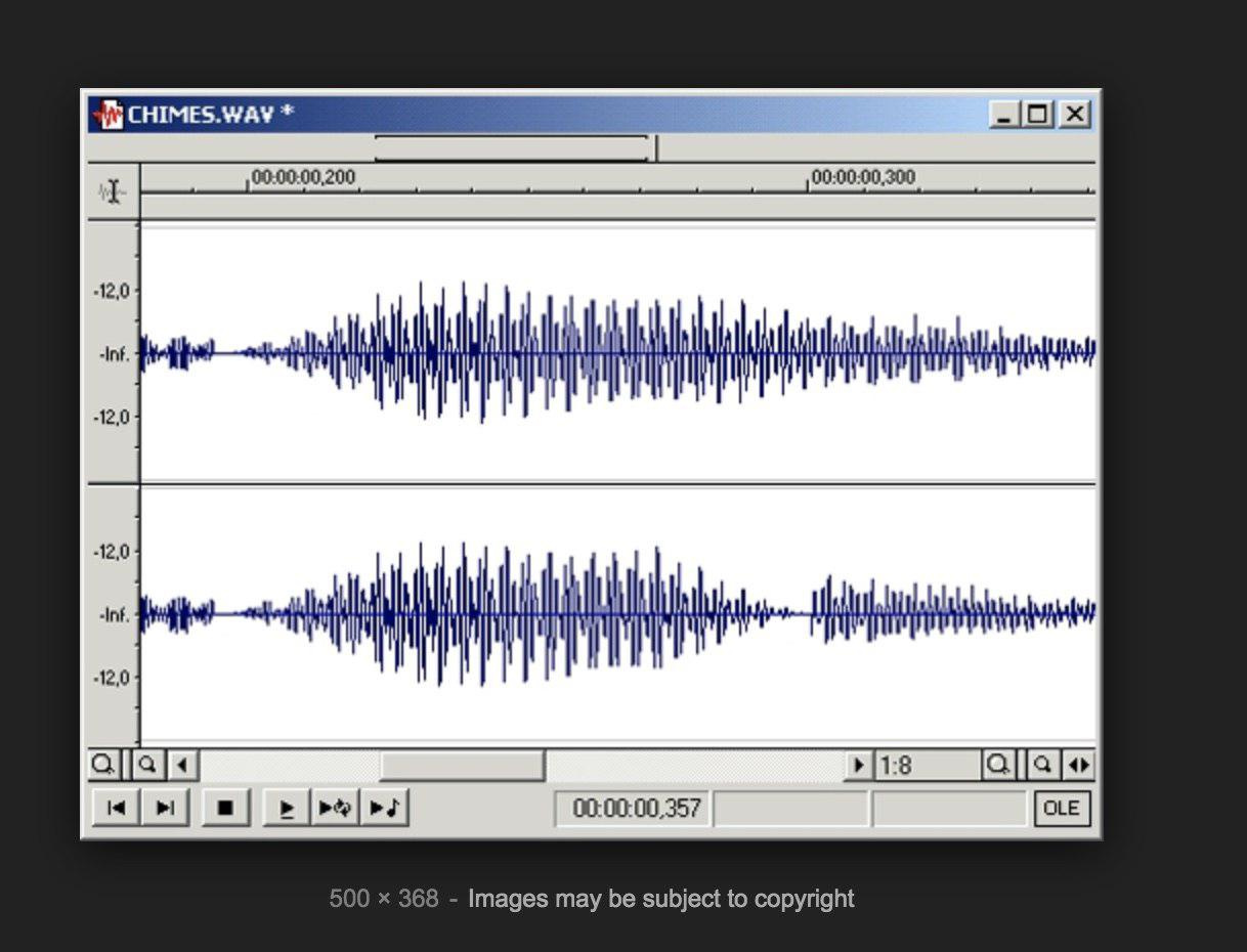
Answer the question
In order to leave comments, you need to log in
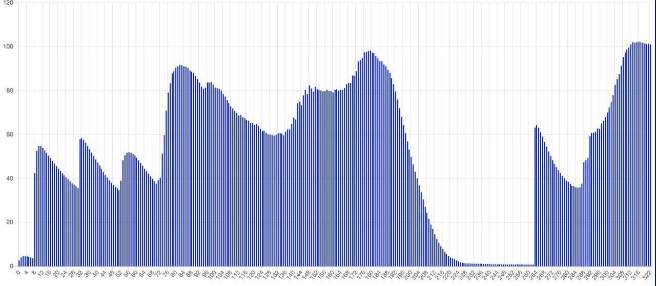
Actually, there are only two generally accepted ways to graphically display sound - this is a graph of the dependence of sound pressure on time (oscillogram) and a graph of the amplitudes of harmonic components of different frequencies (spectrogram). Both of them are absolutely equal (albeit with different areas of application), and one is relatively easy to convert to another. This is your question, which is better - none, or both.
Your top drawing is clearly an oscillogram. But the lower one... It looks a bit like a spectrogram, but obviously not it, since the frequency is plotted along the horizontal axis of the spectrogram, and here are some strange numbers. And besides, typical sound spectrograms have a decline to high frequencies (above 20 kilohertz, the intensity of harmonics generally tends to zero), and here there is some kind of incomprehensible picture with a dip in the middle. I suspect that the second - no sound at all.
Didn't find what you were looking for?
Ask your questionAsk a Question
731 491 924 answers to any question