Answer the question
In order to leave comments, you need to log in
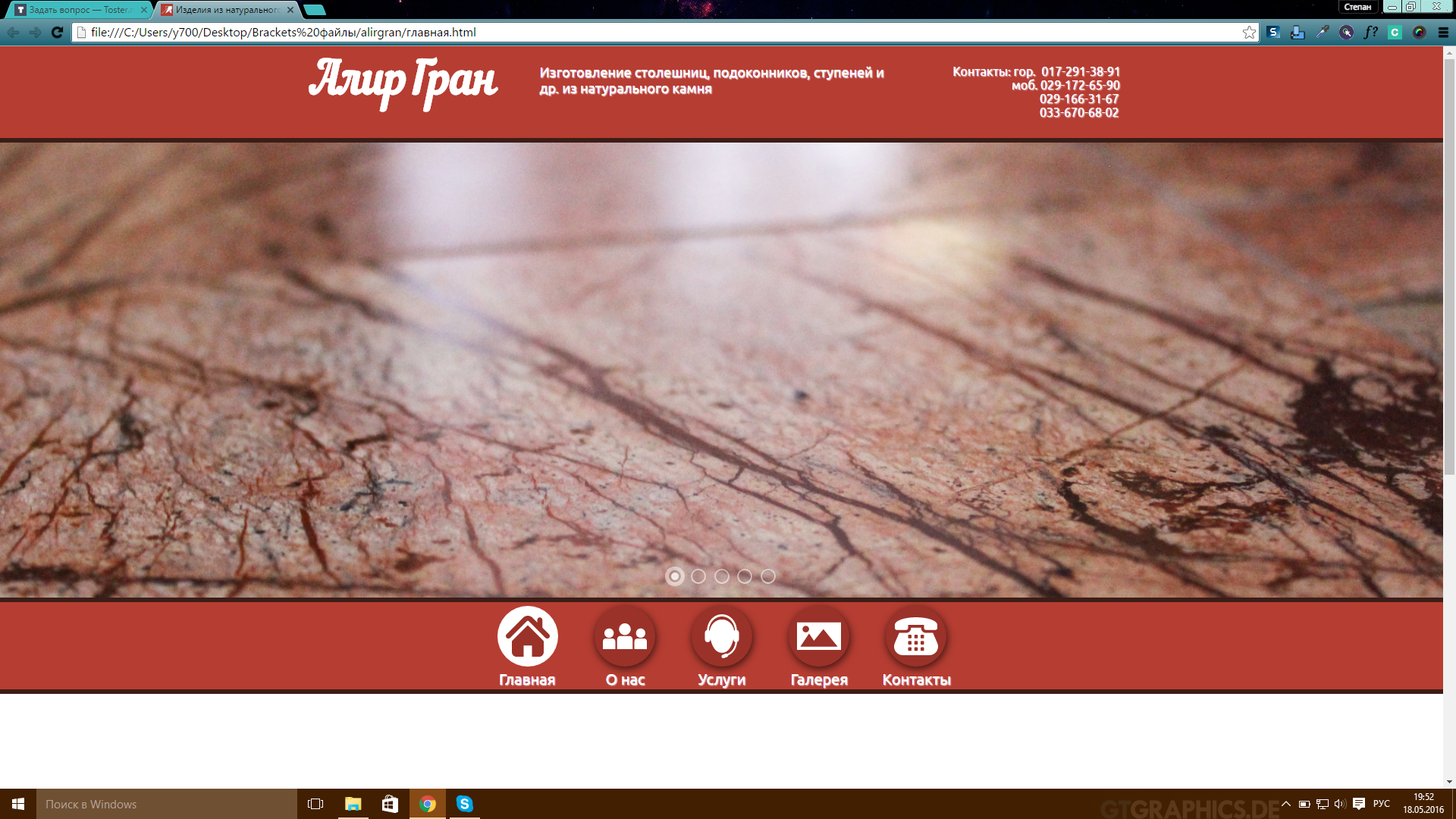
What is the best way to design a website header?
I don’t really like the design of the header and the color palette of the site itself. What color is more suitable, and what design to make for a hat?
Answer the question
In order to leave comments, you need to log in
If you don’t have your own ideas, look at how they do it on other sites, go to https://www.behance.net or revision.ru/works/list/r7/?f
or see themeforest.net here
Add a description to the slides, the name of the company in a different font. And why red? Look at similar sites. Why is the menu at the bottom?
What to think? To begin with, remove the red plate. In the photo and jak will be seen. And there you can look further. You may need to change fonts.
Didn't find what you were looking for?
Ask your questionAsk a Question
731 491 924 answers to any question