Answer the question
In order to leave comments, you need to log in
What file size to create and what content width to use when designing on imac?
Hello! a week ago I switched to a poppy, before that I used Windows with a screen size of 1920x1080 pixels, respectively, and I drew all layouts with a width of 1920 pixels. Now on a poppy, the width is 2880, respectively, when I create a layout in Photoshop 1920 pixels, it seems much smaller, respectively, and the sites on it are displayed differently, for example, on Windows open the official apple website there is a content width of 1024 pixels, and when I open it on a poppy there is a width more than 1600 pixels. This is the question, should I now create a project with a width of 2880 pixels and a content width larger than I did before, or what values should I use now?
Answer the question
In order to leave comments, you need to log in
Six months ago I had the same question How to work in Photoshop on retina? , eventually switched to sketch. What I recommend you do, Photoshop is the last century for design)
2880x1800 is just 3k retina.
By and large, the pixel density is increased, not the actual screen size.
That is, you should have the display of sites as on laptops 15 '- 1440x900 with the correct layout.
You need to keep doing under 1920 like you did before.
But how it will be displayed, small or adapt to the retina, is the work of the layout designer.
PS: In principle, you can make sites "under the retina", that is, in the same way, by increasing the number of pixels by 2.
Instead of 1920, do it at 3840, for your convenience, and write to the layout designer that it is x2 for retina.
I think many layout designers will only say "Thank you very much" for this if all the graphics are immediately optimized for high pixel density monitors.
PPS: Well, as for the Gardening site "Yabloko" :)
As I already noted, your monitor is an analogue of a monitor with a resolution of 1440x900.
Now we count. Let's make a simple proportion.
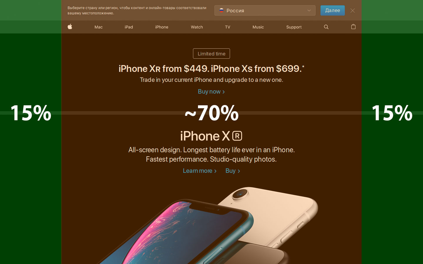
1440 * X \u003d 100 * 1024, X \u003d 71.112% approximately occupies the apple site on a typical laptop monitor.
Now let's make the same proportion for your monitor.
2880 * 71 = 100 * X, X = 2044.8 pixels should look like your apple site.
In ideal conditions, if there are no media queries that change the width of the site on laptops.
And I suspect that they are, so you have more than 1600.
I do not have a Mac to check the display.
Just math and layout basics.
This is how an apple website should look like on a 1440x900 monitor.
And approximately the same ratio of the sides should be 2880x1800 on the retina.
I mean padding from the edges to the content area.
On poppies with retina, it was somehow possible to set up the display as 1920, I don’t remember how it was set up, but it was set up on the retina display.
And the layout should always be 1920 pixels . How it is displayed on your macbook is the tenth thing)))) Layout designer, and all site visitors will look at sites from 1920 and less ... Can you imagine if you make a 2880 layout?)))))
Conclusion - figure out the display settings in macbook . I do not remember how, they set up that everything was displayed correctly.
The maximum width is 2560 for old imas without retina. In principle, you can also stretch an image of 1600 pixels to fit this resolution, but most layout designers limit the width to 1920 and get the image cropped on the sides
I've installed figma, I click on the project preview, I scale it to 100% and I can't scroll the project, why?
Didn't find what you were looking for?
Ask your questionAsk a Question
731 491 924 answers to any question