Answer the question
In order to leave comments, you need to log in
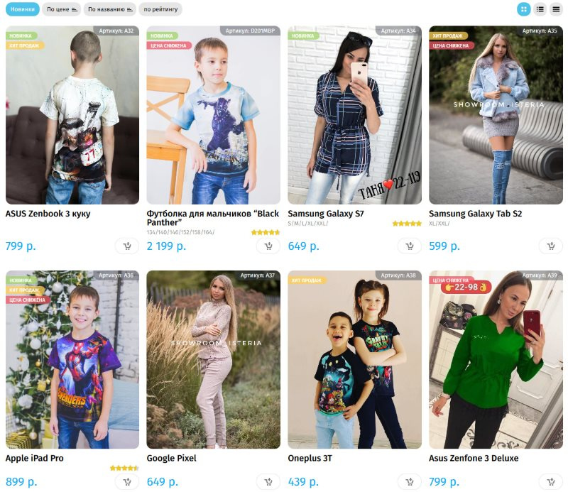
What are the options for designing product cards for an online store?
Please advise how to redraw the block with the price and the button to the basket , the brain is already boiling, I went through all the options (in particular, the price inside the buy button, etc.), the output is still something wrong.
From me a bonus to all who answered - I will mark the solution!
Well, as usual: in your questions - my efficient answers, you tell me - I tell you , as they say.
)))
Answer the question
In order to leave comments, you need to log in
The button clearly needs to be made larger, with the text "Add to cart". From the UX side, it will not be clear to everyone what this button does and it is not noticeable at all. It is better to make it with a background in the colors of the site, i.e. so that it calls for action and you want to click on it, now it merges with the background (a gray icon in this case is better than a white one).
I would make the price at the top left (where the size description is below) and just below the "Add to cart" button, separately. Attention always falls on the available sizes and the price will be there, along with the buy button. Nothing will be lost.
Didn't find what you were looking for?
Ask your questionAsk a Question
731 491 924 answers to any question