Answer the question
In order to leave comments, you need to log in
Vol. 3 What to change in design?
I already asked this question and they gave me a lot of useful advice and advised a book that I had already begun to study.
Vol. 2 What to change in design? - previous post
Do you see progress? Did I correctly take into account the comments that were written to me in the comments in the last post? What other points can you highlight to improve the visualization of the site?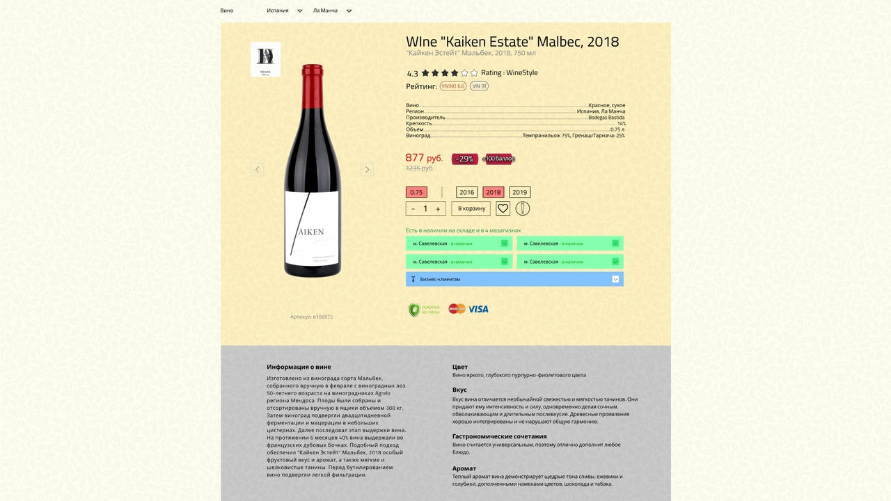
Answer the question
In order to leave comments, you need to log in
Fathers, so many tips and nothing)))
Remove this background altogether. Not yellow, not red, not green. Leave it just white. No need to shove pictures of wine there.
Why container borders are needed here is also unclear.
All icons must be the same line width. You cannot make one thing bold, and the second element of the same field thin. You have a heart of one thickness, an exclamation mark of another - they don’t do that. Should be the same style.
If you don't know how to make icons yourself, or at least download similar ones in style, use ready-made sets
. Use only 2 font styles, and a maximum of 3 for something non-standard.
Headings - 1
Subheadings/Switches - 2nd
Sample Text - 3rd
All. Forget italica + bold + light + regular + super bold + light italica in one layout.
All buttons are the same. The order button is far from being as important as, for example, "add to favorites". Why is she prominent? Ordering is obviously more important. Why are they the same size/color?
You are learning, but you can immediately see what you are trying to do just at random.
Make yourself a prototype of the page, throw the order of elements in order of importance from largest to smallest.
Open behance and find minimalism web design or ui/ux kit
Ideally, download some Minimalist site ui/ux kit and build a site
https://www.behance.net/gallery/44035703/ANTIDESIG...
Are you trying cross several styles without being able to work in any of them. They don't do that.
Practice is good. But the practice must be based on something. It's clear from your work that you don't even know the basics.
Composition - what it is / how it works / how it is right, etc. What are colors / how to work with them, etc. Psychology of behavior on the site. What is important / what is not. What can/cannot be done and why. Typography is a critical foundation for everything visual. Without understanding it, at least 70%, you will continue to sculpt shit.
You won't learn it without knowing these basics. In theory, yes, of course you can, but it will take a very long time to reach you.
I also studied in practice, for 3 years I did fierce shit. Then, in the end, I realized that it would be necessary to know the basics and understand why, began to study. And only then, after theory + practice = shit, but better. I have learned to do something.
Pounding a toaster with questions you will not get a masterpiece + you yourself will be tempted to read the under-professional. One will say daring, the other will say return, eternal swing. Start from the base.
After all, it is so in everything. In the gym, you will not gain mass without doing basic exercises. You can't drive a car if you don't understand the basics . The ass will not be able to sleep without knowing the basic thing of opening the sphincter. Are you savvy?

1. Background is dirty
2. Description - black on dark gray - disgustingly dirty and unreadable
3. Fonts are still small compared to other elements
4. Icons and controls (like like, etc.) just don't seem to have even been worked on
5. Discounts and points are terrible
6. Metro stations seem to be not from here at all
7. The "Add to Cart" button can never be found among this mess .
8. What the hell are payment network icons here for? Let them be in the basket.
Didn't find what you were looking for?
Ask your questionAsk a Question
731 491 924 answers to any question