Answer the question
In order to leave comments, you need to log in
Rate the site. What to add, what to improve?
Please help me evaluate this site. This is the first more or less major project that is nearing completion. Trying to create an online store.
There was a question of the need to rewrite it from scratch (because the Frankenstein monster is hidden under the hood), and on this occasion I'm thinking about improving it.
I would like criticism about the design, convenience, interface, functionality, general impression, and to explain what for what, because the project will go to the portfolio, and I want it to be holistic and exemplary.
https://petite-damsel.netlify.com/
In some places it has not been completed (the section with collections and the possibility of registration, the buttons on the banners on the main page are still a decoration, like the entire main page), it has not yet been optimized for mobile devices and is not too adaptive, designed for 16 * 9.
From the main functionality:
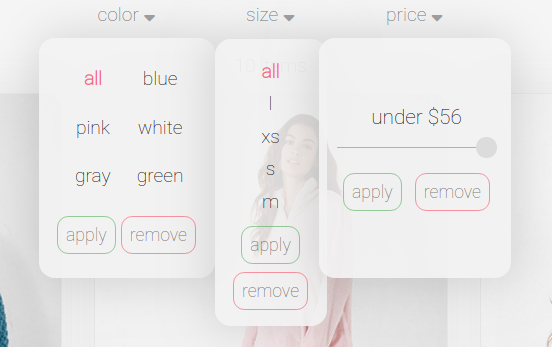
1. On the pages with products, a filter by different parameters is possible. Filters are combined, and their options are individual for each product category.
2. Goods can be added to the shopping cart (provided that the right size is selected and so on. If not selected, a corresponding message will appear).
2. Each product has its own individual page, which displays its own information. Actually, through it they are added to the basket.
Answer the question
In order to leave comments, you need to log in
1. It is very inconvenient that the click area on the basket in the corner of the site is strictly limited to the icon. it is necessary to make the area 3 times wider
2. in the color filter, I would add circles painted in the appropriate color
3. why do the apply and remove buttons in the filters if you cannot select several values at the same time
4. it is more familiar and more convenient to limit the price in the range from and to
5. prices invisible on cards
It seems to me that it would be more pleasant to use, and to some extent more familiar, would be the closing of dropdowns when clicking outside their area (a similar thing with dropdowns for categories)
Didn't find what you were looking for?
Ask your questionAsk a Question
731 491 924 answers to any question