Answer the question
In order to leave comments, you need to log in
Make text more comfortable and readable?
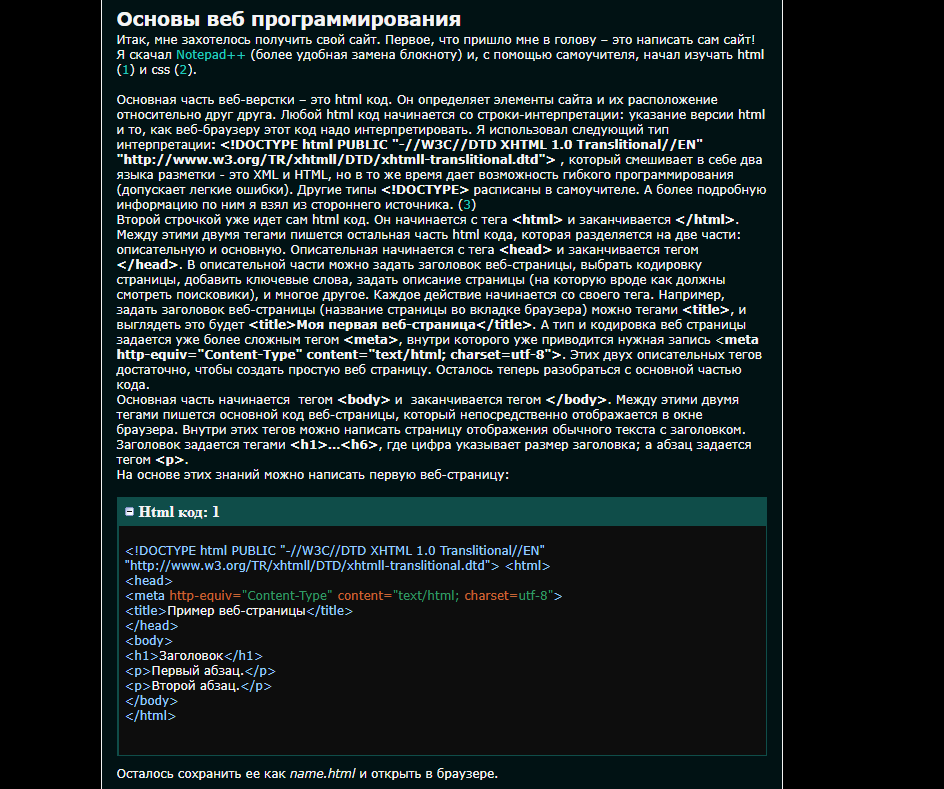
There is random text:

Answer the question
In order to leave comments, you need to log in
A few tips that will help you quickly make a more readable product out of text:
1. Look at the distance between the lines, it has long been known that lines that are very close to each other are read much more slowly. It is difficult for us to switch our gaze to the next line if it is very close to the previous one, and it is also very difficult to find where the next line begins.
2. Dilute the text with infographics or icons, play with visual cues - this way the text will be perceived more interesting.
3. Do not forget about bullet lists, where something is listed, this will make the text more understandable.
4. Break the text into paragraphs, the text should not be read in one go, ideally it can be divided into 3 - 4 paragraphs.
5. Add h3 headings where you can divide the text into semantic parts. For example, here you can apply two headings and divide the text into 2 paragraphs:
Paraphrasing them in: Descriptive part , Main part
Several interesting articles on the topic:
https://habr.com/ru/post/31547/
https://habr.com/ru/post/57351/
https://habr.com /en/post/36654/
Didn't find what you were looking for?
Ask your questionAsk a Question
731 491 924 answers to any question