Answer the question
In order to leave comments, you need to log in
Logo design tips. How to make a better logo?
Recently I sat with a client and looked at her sketches for the logo. In 3 minutes, she did what she liked. But the logo is as simple as possible and I am ashamed to take money for it. Please help me complete this. (logo from the cosmetic industry).
At the moment these are two fonts with monochrome elements.
Answer the question
In order to leave comments, you need to log in
everything is fine, in my opinion, that the theme is guessed correctly, and besides, there is room for variations on the theme.
Those. depending on what the logo will be used for, it can be used almost always - at the same time it can be styled depending on the type - outdoor advertising, office sign, newspaper, web, etc.
Somehow immediately the idea of one of these stylizations - quickly and not fitted, but nonetheless.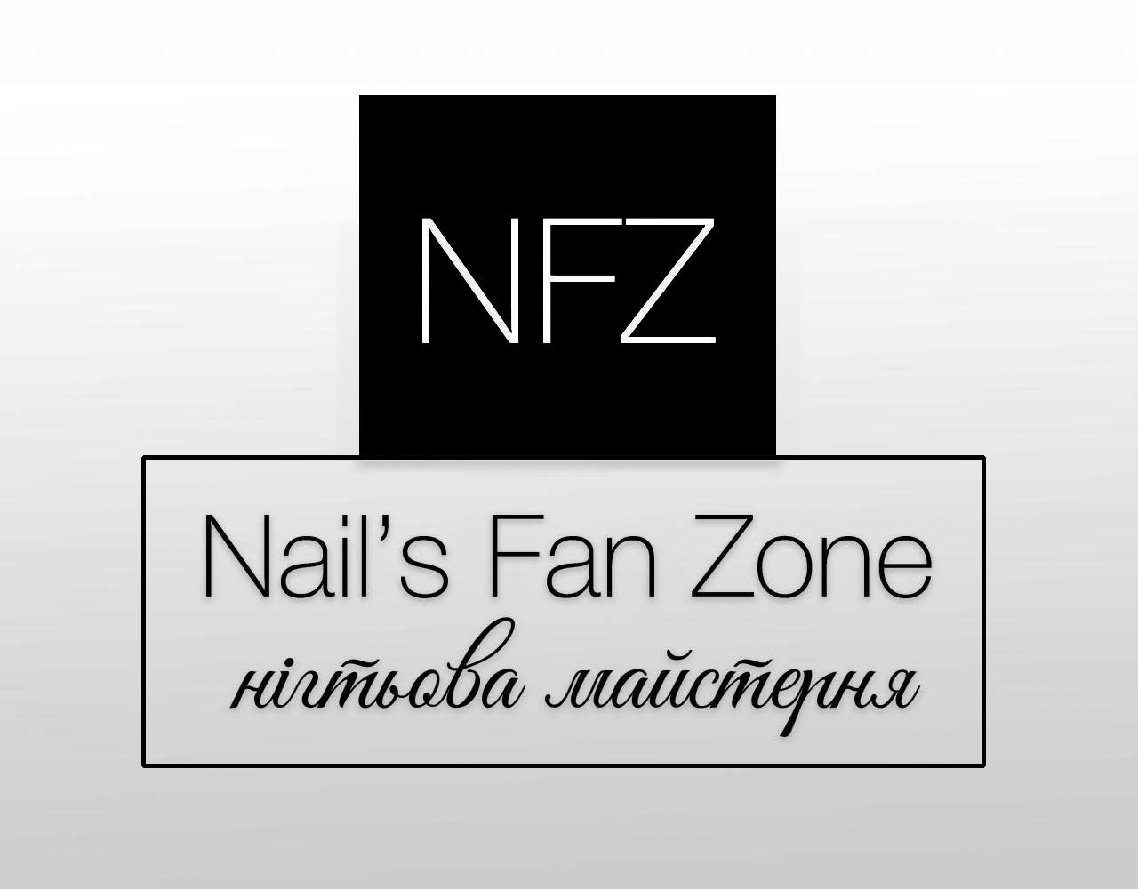
If you like it, take the money and give it to charity, if you are ashamed to take it for yourself
The coolest advice I can give is to keep in touch with such a client. Adequate in our time is a rarity, you can even give a lifetime discount for adequacy.
Correct the sign like this
. Otherwise, ok - to a solid three. you can safely take the money :-)
It's not worth complicating more. It's better to simplify.
Joining the answers above (and to the banter, how could it be without it):
Complicate by simplifying! This is called "high simplicity". As losrogaty wrote, you have compositional inconsistency in terms of subordination (hierarchy of elements, accents). Decide whether to do it: on a transparent background or on a fill, in lowercase or uppercase letters, with or without a stroke. Also, you repeat the name twice: first, abbreviated in three letters, then deciphered, and for the completely stupid, even the slogan (in a different style and in a different language). Understand that the choice is extremely difficult, do not force the user to make it when it does not require it. You are valuable as a designer, that it was YOU who made the choice for the user, solved a difficult task for him - that is what he pays you money for (indirectly). The user wants solutions, not tasks. Love your "user"!
Or play with him, but play interestingly, in a smart way. It is necessary to show off artistically (as well as to rob banks) not in small things, but in a big way - conceptually, ideologically, semantic, and not with a lot of all sorts of spills. Well, or "rob" on trifles, but a LOT and forget about Design, cut the loot)) Good luck!
Didn't find what you were looking for?
Ask your questionAsk a Question
731 491 924 answers to any question