Answer the question
In order to leave comments, you need to log in
Is the layout of my site good?
Here is the link to the code https://github.com/nikitaden03/Bulgaria
Answer the question
In order to leave comments, you need to log in
Yes, it looks very good. Including small mobile screens. But w3c validator swears at some subtleties, for example,
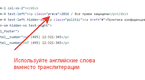
<input type="mail" class="form__input" required placeholder="E-mail">In fact, not everything is so good if you stick to the BEM methodology. Just looked at the markup: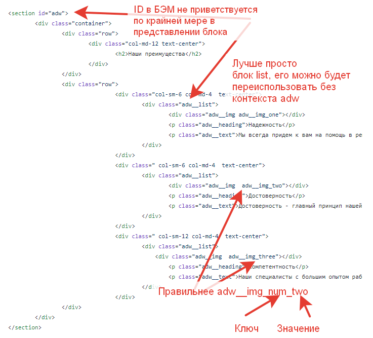
Immediately, I note that I looked only at the main page.
The HTML code as a whole looks quite clean, PHPStorm only complains about the ul inside the menu which is really not allowed . The forced animation on all elements is
somewhat embarrassing . I don't think that browsers, especially mobile ones, will be happy with such styles. In addition, it leads to at least very strange menu jumps when passing through 1200px.
The desktop menu does not align vertically. for menu blocks and phones in the header, "alignment" via margin-top is used, rather than normal alignment via flexbox with align-items: center.
The blocks in the "Our Benefits" section lack at least horizontal paddings, which causes the text in the blocks to stick to the borders of the containers. In the same block, letter-spacing was lost in the main header and block headers (I didn’t measure it, you can see it by eye). With a width less than 980px, the blocks go off the screen, apparently not completed yet.
The block "Moving to Bulgaria" is completely broken at a width of 980..1200px, and even narrower - some of the elements are out of alignment. The .move__how block has the same horizontal padding problem as the block above.
Property block - same problem with centering (button), letter-spacing and horizontal padding.
By the way,here .
Feedback block: left/right navigation icons don't match the layout, obviously taken from font-awesome even though they are different in the layout. By the way, the same applies to the "fa-angle-down" icon, it's also not from font awesome in the layout. The vertical position of the navigation icons does not match the layout (the paginator block should not be taken into account). In-block padding and letter-spacing seem to be a common sore point. Due to the fact that the 3 elements of the review header are not combined into a common container, there is a problem with alignment and without a container, it is treated not quite trivially. The arrow in "Moscow -> Sofia" does not match the layout.
Form block: :focus state is not implemented (in the layout it is E-mail), below 768px the form elements stick to the edges of the screen without any padding. The block's bottom darkening gradient is missing. The down arrow icon doesn't fit the layout (here and elsewhere). The style of the button differs from the layout (border and font style)
Separate large fi - graphics and general relation to resource sizes:
Didn't find what you were looking for?
Ask your questionAsk a Question
731 491 924 answers to any question