Answer the question
In order to leave comments, you need to log in
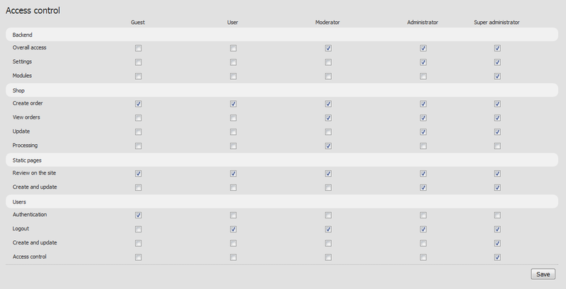
Is it difficult to understand such an interface?
I got confused with setting the rights, in the end I did this miracle. How difficult will it be to understand for an ignorant person?

Maybe there is an example of a more successful implementation of setting rights?
Answer the question
In order to leave comments, you need to log in
It would be more convenient for me if I could transpose the sign (users vertically, right horizontally).
But this is a personal opinion, so to speak :)
prestashop, very user-friendly interface, of course they are not the first, but I don’t often work with cms:
Select - role

No, well, you don’t like your users, the table was turned over for some reason, but why mock the respondents, reduce the picture to unreadable sizes? The place is full:

1) Separate rights items with tabs or number them in order to separate them from categories not only with a background
2) Make it all narrower or make horizontal lines for each rights item (otherwise the checkboxes are far away and you can confuse in a hurry which item they belong to)
Horizontally we arrange what is less. In this case, there are fewer roles - they are horizontal. And scroll up and down as usual.
If the groups are permanent (i.e. you cannot add or remove a group), then this option is the most ideal. If the groups can be changed, then it is better to transpose the plate (as already noted in the 1st answer) or make a setting, similar to what is implemented in DLE. From the list you select a group, and then a list of settings appears.
Didn't find what you were looking for?
Ask your questionAsk a Question
731 491 924 answers to any question