Answer the question
In order to leave comments, you need to log in
Incorrect scaling of elements when the window size is less than 384px, what should I do?
Blocks scale incorrectly when device length is less than 384px.
What need to do?
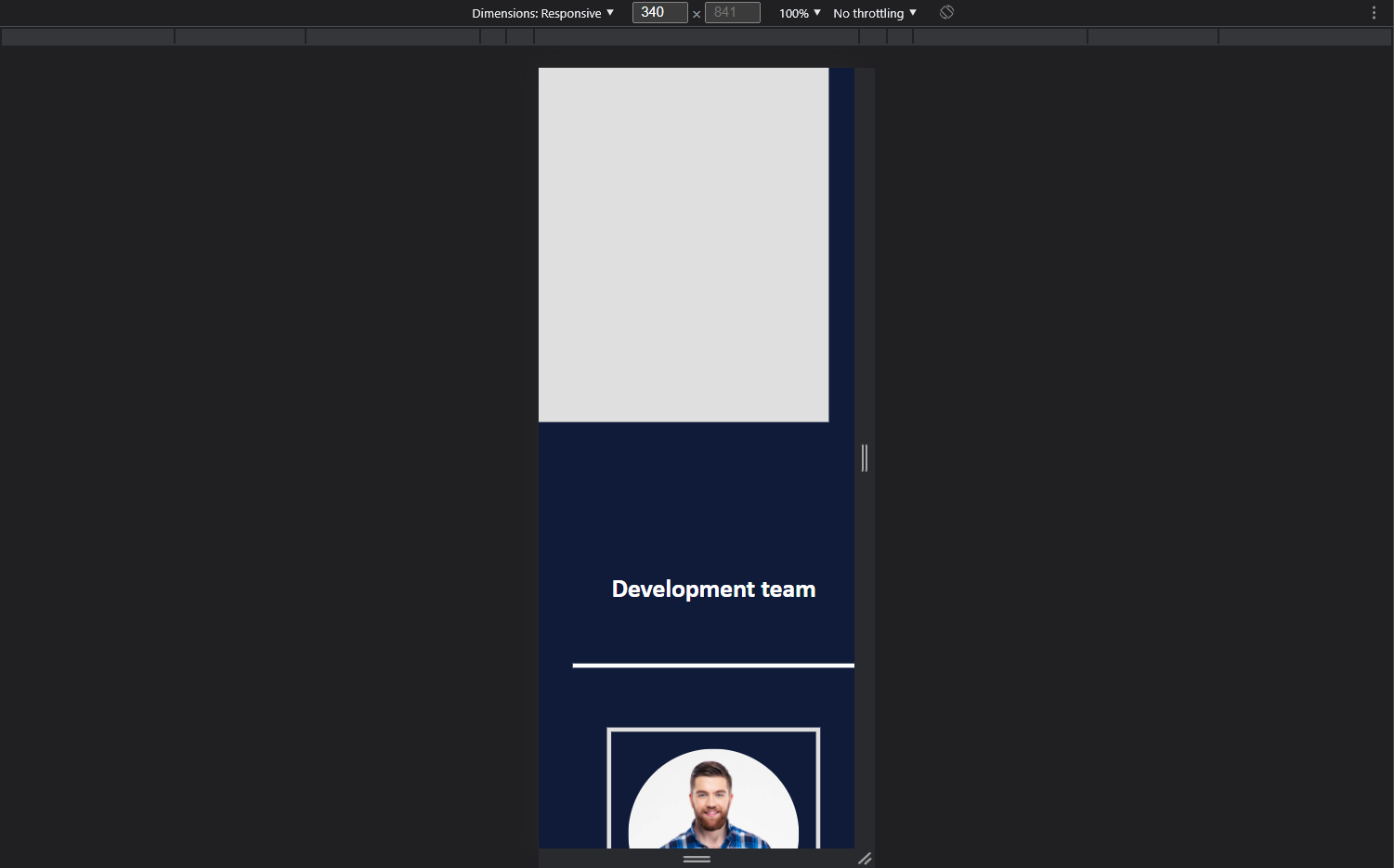 <- Abnormal
<!DOCTYPE html>
<html lang="en">
    <head>
        <meta charset="UTF-8">
        <meta http-equiv="X-UA-Compatible" content="IE=edge">
        <meta name="viewport" content="width=device-width, initial-scale=1.0">
        <title>Web</title>
    </head>
    <body>
        <div class="page block0" id="elem0">
            <div class="pageIn blockElem0" id="elemIn0">
                <h1>Web</h1>
                <p>Lorem ipsum dolor sit amet et delectus accommodare his consul copiosae legendos at vix ad putent delectus delicata usu. Vidit dissentiet eos cu eum an brute copiosae hendrerit. Eos erant dolorum an. Per facer affert ut. Mei iisque mentitum moderatius cu. Sit munere facilis accusam eu dicat falli consulatu at vis. Te facilisis mnesarchum qui posse omnium mediocritatem</p>
                <div class="blockIn blockBtns" id="blockBtns">
                    <a href="" class="getStart btn" id="btnStart">Get started</a>
                    <a href="" class="learnMore btn" id="btnMore">Learn more</a>
                </div>
            </div>
            <div class="pageIn blockElem1" id="elemIn1">
                <img src="https://themesvila.com/themes-wp/coincap/wp-content/uploads/2021/06/home-main.png">
            </div>
        </div>
        <div class="page block1" id="elem1"></div>
        <div class="page block2" id="elem2">
            <div class="pageIn blockElem0 txtPannel" id="elemIn2">
                <h1>Development team</h1><br>
                <div class="blockIn blockLine" id="line"></div>
            </div>
            <div class="pageIn blockElem1 flexPannel cards" id="elemIn3">

                <div class="blockIn card card0" id="card">
                    <img src="https://themesvila.com/themes-wp/coincap/wp-content/uploads/2021/06/1.jpg" class="cardImg img cardImg0" id="cardImg0">
                    <h1>Name<br>Surname</h1>
                    <div class="cardIn contacts iconsContacts" id="iconsContacts">
                        <a href="https://www.instagram.com/" id="iconContactPeople" class="instagram fa fa-instagram iconContactsIn" target=”_blank”></a>
                        <a href="https://www.facebook.com/" id="iconContactPeople" class="facebook fa fa-facebook iconContactsIn" target=”_blank”></a>
                        <a href="https://twitter.com/?lang=en" id="iconContactPeople" class="twitter fa fa-twitter iconContactsIn" target=”_blank”></a>
                    </div>
                    <div class="cardIn staff" id="staff">
                        Developer
                    </div>
                </div>
            </div>
        </div>
    </body>
</html>
*{
padding: 0;
margin: 0;
font-family: var(--font);
transition: .4s;
box-sizing: border-box;
}
body{
background: var(--darkblue);
padding: 0;
margin: 0;
}
a, button{
user-select: none;
cursor: pointer;
text-decoration: none;
font-family: var(--fontbtn);
font-weight: 500;
}
img{
user-select: none;
}
.page{
min-width: none;
min-height: 550px;
height: 100vh;
}
.block0{
width: 100%;
min-width: none;
height: 100vh;
display: flex;
flex-wrap: wrap;
align-items: center;
text-align: center;
justify-content: center;
justify-items: center;
box-sizing: border-box;
z-index: 1;
}
.block0 .pageIn{
width: 25vw;
min-width: 300px;
height: auto;
background: none;
margin: 20px;
box-sizing: border-box;
}
.block0 h1{
color: var(--lightwhite);
}
.block0 p{
color: var(--grey);;
padding-bottom: 30px;
padding-top: 20px;
}
.block0 a{
width: 50%;
min-width: 160px;
text-align: center;
}
.block0 .blockBtns{
text-align: left;
display: flex;
align-items: center;
}
.block0 .getStart{
margin-right: 30px;
background: var(--blue);
border: solid 5px var(--blue);
color: var(--lightwhite);
}
.block0 .getStart:hover{
transform: scale(110%);
background: var(--lightwhite);
border: solid 5px var(--lightwhite);
color: var(--blue);
-webkit-box-shadow: 0px 0px 60px 0px rgba(255, 255, 255, 0.2);
-moz-box-shadow: 0px 0px 60px 0px rgba(255, 255, 255, 0.2);
box-shadow: 0px 0px 60px 0px rgba(255, 255, 255, 0.2);
}
.block0 .learnMore{
border: solid 5px var(--lightwhite);
background: rgba(255, 255, 255, 0);
color: var(--lightwhite);
}
.block0 .learnMore:hover{
transform: scale(110%);
background: var(--blue);
border: solid 5px var(--blue);
color: var(--lightwhite);
-webkit-box-shadow: 0px 0px 60px 0px rgba(255, 255, 255, 0.2);
-moz-box-shadow: 0px 0px 60px 0px rgba(255, 255, 255, 0.2);
box-shadow: 0px 0px 60px 0px rgba(255, 255, 255, 0.2);
}
.block1{
background: var(--white);
height: 100vh;
width: 100%;
}
.block2{
padding-top: calc(15vh + 50px);
padding-bottom: calc(15vh + 50px);
padding-right: 40px;
padding-left: 40px;
height: auto;
text-align: center;
display: grid;
}
.block2 .pageIn{
width: 100%;
text-align: center;
display: flex;
flex-wrap: wrap;
justify-content: center;
}
.block2 h1{
color: var(--lightwhite);
font-size: 40px;
padding-bottom: 40px;
}
.block2 .card h1{
color: var(--lightwhite);
font-size: 40px;
font-style: italic;
transform: rotate(-3deg);
padding-top: 10px;
padding-bottom: 10px;
}
.block2 a{
color: var(--white);
font-size: 25px;
margin: 10px;
height: 20px;
width: 20px;
padding-bottom: 30px;
}
.block2 a:hover{
transform: scale(110%);
color: var(--lightwhite);
}
.block2 .staff{
color: var(--lightwhite);
text-decoration: underline;
font-size: 20px;
font-weight: 600;
}
.block2 .blockLine{
background: var(--lightwhite);
width: 100%;
height: 5px;
margin-top: 30px;
margin-bottom: 30px;
}
.block2 img{
border-radius: 50%;
min-width: none;
width: 100%;
}
.block2 .card{
border: solid 5px var(--white);
padding: 20px;
min-width: 250px;
max-width: 320px;
box-sizing: border-box;
text-align: center;
align-items: center;
justify-content: center;
margin: 40px;
}
.block2 .card:hover{
transform: scale(105%);
border-color: var(--lightwhite);
-webkit-box-shadow: 0px 0px 60px 0px rgba(255, 255, 255, 0.2);
-moz-box-shadow: 0px 0px 60px 0px rgba(255, 255, 255, 0.2);
box-shadow: 0px 0px 60px 0px rgba(255, 255, 255, 0.2);
}
.block2 .flexPannel{
display: flex;
text-align: center;
justify-content: center;
align-items: center;
}
.block3{
background: var(--white);
text-align: center;
justify-content: center;
justify-self: center;
padding-top: calc(15vh + 50px);
padding-bottom: calc(15vh + 50px);
}
@media (min-width: 1200px) {
.block0 .pageIn{
text-align: left;
}
.block0 h1{
font-size: 50px;
}
.block0 p{
font-size: 20px;
}
.block0 .getStart{
font-size: 25px;
padding: 17px;
}
.block0 .learnMore{
font-size: 25px;
padding: 17px;
}
.block0 .blockBtns{
justify-content: left;
}
}
@media (min-width: 992px) and (max-width: 1199px) {
.block0 .pageIn{
text-align: left;
}
.block0 h1{
font-size: 40px;
}
.block0 p{
font-size: 17px;
}
.block0 .getStart{
font-size: 22px;
padding: 11px;
}
.block0 .learnMore{
font-size: 22px;
padding: 11px;
}
.block0 .blockBtns{
justify-content: left;
}
}
@media (min-width: 768px) and (max-width: 991px) {
.block0 .pageIn{
text-align: left;
}
.block0 h1{
font-size: 40px;
}
.block0 p{
font-size: 17px;
}
.block0 .getStart{
font-size: 20px;
padding: 10px;
}
.block0 .learnMore{
font-size: 20px;
padding: 10px;
}
.block0 .blockBtns{
justify-content: left;
}
}
@media (max-width: 767px) {
.block0 .pageIn{
text-align: center;
}
.block0 h1{
font-size: 35px;
}
.block0 p{
font-size: 15px;
}
.block0 .blockBtns{
justify-content: center;
}
.block0 .learnMore{
font-size: 17px;
padding: 7px;
}
.block0 a{
width: 40%;
min-width: 130px;
}
.block0 .getStart{
font-size: 17px;
padding: 7px;
}
.block2 h1{
font-size: 30px;
}
.block2 .card h1{
font-size: 30px;
}
.page{
width: 100%;
}
.pageIn{
padding: 0;
}
.block0 .pageIn{
margin: 0;
}
.block0 a{
min-width: none;
}
}
@media (max-width: 450px) {
.block0 .pageIn{
margin: 0;
min-width: none;
}
}
:root{
--white: #dfdfdf;
--lightwhite: #fff;
--grey:#FFFFFF99;
--yellow: #FFD234;
--black: #333333;
--green: #00A97F;
--darkblue: #0f1b39;
--blue: #00a0f0;
--red: rgb(179, 81, 81);
--font: 'Gill Sans', 'Gill Sans MT', Calibri, 'Trebuchet MS', sans-serif;
--fontbtn: 'Franklin Gothic Medium', 'Arial Narrow', Arial, sans-serif;
}Answer the question
In order to leave comments, you need to log in
Why did you roll out a sheet of code here? No one will read it or, moreover, waste time inserting it into the editor. Show basic respect for the community if you want help.
On the merits of the question: the problem is most likely not in "scaling", but in the fact that some block on the page crawls out of the container, increasing the overall width of the page. Check each container through devtools to find the problem.
PS There is a life hack for such a situation.
Apply the following styles:
body * {
    box-shadow: 0 0 5px 1px #FF0000;
}Didn't find what you were looking for?
Ask your questionAsk a Question
731 491 924 answers to any question