Answer the question
In order to leave comments, you need to log in
How to "stretch" the menu to the full width of the screen?
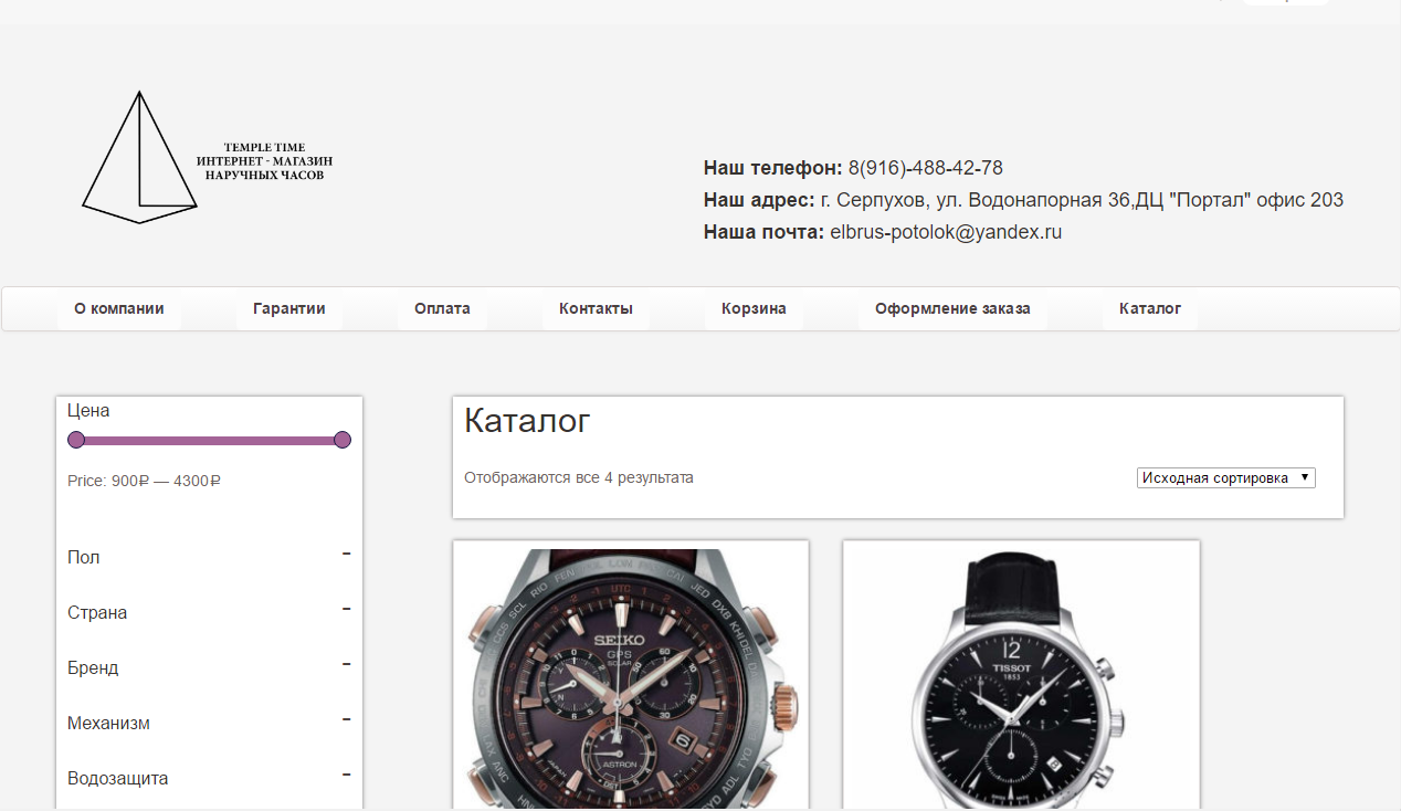
Good day to all. I need to stretch the menu to the full width of the screen, how can I do this? A friend said that the layout is crooked, and the wrapper needs to be swapped with the content. But I would like to know in more detail. Since I was picking, but nothing happened.
The site
itself
Thank you in advance for your reply.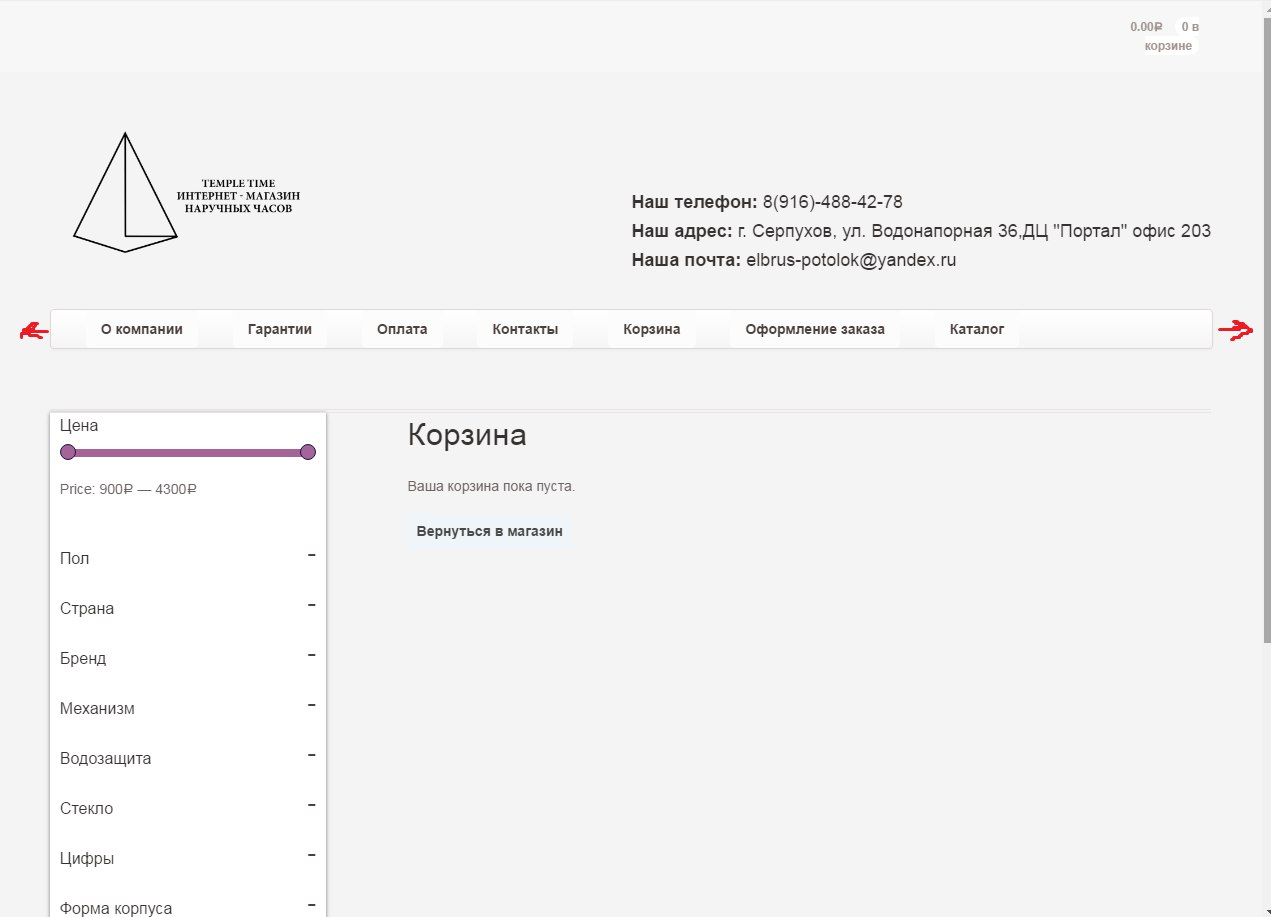
Answer the question
In order to leave comments, you need to log in
Alternatively, you can add this to your css file
#navigation {
    width: calc(100% - (-99px));
    margin-left: -50px;
}@media only screen and (min-width: 768px){
ul.nav li {
padding-left: 3%;
}
}@media only screen and (min-width: 768px){
ul.nav li {
padding-left: 50px;
}
}
You have it to be in the container or wrapper, depending on how you called it. You need to display the menu from there and give the width 100% throw off the site code, I'll tell you for sure then
<nav class="main-nav">
<a href="#">Главная</a>
<a href="#">Доставка и оплата</a>
<a href="#">О компании</a>
<a href="#">Отзывы</a>
<a href="#">Контакты</a>
</nav>
.main-nav
display: table
position: relative
width: 100%
height: 60px
a
color: #000
display: table-cell
text-align: center
vertical-align: middle
min-width: 120px
text-decoration: none
border-left: 1px solid lighten($accent, 5%)
transition: background-color 1s easy
&:last-child
border-right: 1px solid lighten($accent, 5%)
&:hover
background-color: lighten($accent, 5%)
text-decoration: none
transition: background 1s easyDidn't find what you were looking for?
Ask your questionAsk a Question
731 491 924 answers to any question